Kmart's controversial solution to checkout woes: A first look at the Melbourne store trial

For over a decade, Kmart customers have grown accustomed to the discount retailer's unconventional layout that places checkouts in the middle of stores.

However, the design choice has proven divisive, with many questioning the way the budget retailer differs from other stores with where it places its checkout counters.

This floorplan could soon change as the company trials a new layout in one store.


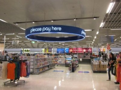
In what could signal a major shift, Kmart is testing a new checkout location at its Eastland store in Melbourne. Under the trial, registers have been relocated from the store centre to a new checkout area near the exit.

In short, customers taking part in the trial will experience a more traditional retail layout. Instead of queuing for registers surrounded by aisles of merchandise, shoppers will now pay at the front of the store before leaving.


4539ed3564ed61c7b61b27c6feff5cb2246f86e8-4x3-x0y1w649h487.jpg
Kmart’s current layout scheme has drawn much criticism from shoppers. Credit: Facebook


A Kmart spokesperson confirmed this change, stating that the store is currently under renovation and will undergo ‘a range of new store elements over the next year or so’.

‘As a business, we are always looking for ways to make our customer experience better, so trying out new things is just part of what we do,’ they said.


The spokesperson added: ‘As always, we have a number of trials taking place involving lots of new ideas so we can see what our customers think. As these are rolled out, we look forward to hearing our customers' feedback so we can continue to adapt and improve.’

As of writing, the retailer has yet to make plans to implement this change to other stores in the country.

Earlier this year, Kmart shoppers criticised the store layout, stating that they treat ‘every shopper like a shoplifter’.

One social media user wrote: ‘Dear Kmart Australia, why put the checkout area in the middle of the store if you’re going to treat every shopper like a shoplifter on the way out?’

At the time, Kmart shared that the checkout decision ‘made several years ago…to make shopping more convenient, ensuring store entrances are free of queues and clutter, and allowing customers to enter and exit with ease’.

‘This current layout is more open and more spacious without having the registers up at the front of the store, which can get congested during busy times of the year like Christmas,’ they explained.


Members of the Senior Discount Club have mixed opinions on this matter, with some sharing their frustration about the checkout location.

Member @Marian M wrote: ‘I do like KMart for their low prices, but I do get frustrated with the checkout being where it is. I always have to walk further to get to it and as it is placed awkwardly. It is a st****place to put it.’

‘Then to have to keep the receipt handy when exiting. I do not think they have ever really checked my receipt; they just glance at it, and some often don't bother doing that,’ the member continued.


Member @carosb13 said: ‘I have no issue with my bags being checked, but it wouldn't be necessary if the checkouts were left at the entrance to the store, where they used to be! Often, it's hard to find them too, and one walks a lot extra.’

Member @Margaret 9 shared: ‘I used to shop at Kmart regularly until they moved the checkouts to the middle of the store, and then I had to queue to leave the store to have my bag and receipt checked, they even check the carrier off the back of my mobility scooter!’

‘I have never stolen anything in my life, and Kmart's detailed checking of everywhere I could possibly have hidden something is annoying!’ They added.


On the other hand, some members don’t mind having the checkout counters in the middle of the store.

‘I don’t mind where the checkout is at present. I don’t think it matters where the checkout is, we all go into, buy whatever and leave. Can’t see what the big deal is!!’ member @LeslieD expressed.

‘With so much shoplifting going on, they have to check receipts, etc. Otherwise, the cost of everything goes up to make up for the stealing. I'm quite happy to be checked on the way out of the store. Also, the checkout in the centre makes sense, never had to wait to use a register,’ member @Col@45 said.

‘When you think about it, shoplifting keeps costs up, I don’t mind a middle of store set up it used to be a cluttered mess at the door. My local Kmart had a person who clicks your receipt with the machine, which prevents people who might steal a second item and use the receipt to return it. If it saves me money, I can deal with waiting, and at 82, it isn’t easy,’ member @Isis stated.

Key Takeaways
  • Kmart is trialling a new checkout location at its Eastland store in Melbourne, moving cash registers from the centre of the store to the exit.
  • The trial is part of Kmart's ongoing efforts to improve the customer experience and comes after backlash over the previous layout, which some shoppers criticised as treating 'every shopper like a shoplifter'.
  • The retailer has confirmed it is testing various new elements in the store, but no plans have been announced to implement this change in other stores across Australia.
  • Earlier this year, customers suggested changes to the store layout, including moving the checkout counters to the front of the store.

Should this be implemented everywhere, members? Share your thoughts in the comments below!
 
Sponsored
I hope they reintroduce staff operated checkouts. Self serve checkouts are so slow because of the errors that that customers make which hold up the que. It was a rather expensive mistake on Kmarts behalf with no benefits whatsoever. Now we will have to pay for the stuff up. Profits ahead of service.
 
For over a decade, Kmart customers have grown accustomed to the discount retailer's unconventional layout that places checkouts in the middle of stores.

However, the design choice has proven divisive, with many questioning the way the budget retailer differs from other stores with where it places its checkout counters.

This floorplan could soon change as the company trials a new layout in one store.


In what could signal a major shift, Kmart is testing a new checkout location at its Eastland store in Melbourne. Under the trial, registers have been relocated from the store centre to a new checkout area near the exit.

In short, customers taking part in the trial will experience a more traditional retail layout. Instead of queuing for registers surrounded by aisles of merchandise, shoppers will now pay at the front of the store before leaving.


View attachment 31758
Kmart’s current layout scheme has drawn much criticism from shoppers. Credit: Facebook


A Kmart spokesperson confirmed this change, stating that the store is currently under renovation and will undergo ‘a range of new store elements over the next year or so’.

‘As a business, we are always looking for ways to make our customer experience better, so trying out new things is just part of what we do,’ they said.


The spokesperson added: ‘As always, we have a number of trials taking place involving lots of new ideas so we can see what our customers think. As these are rolled out, we look forward to hearing our customers' feedback so we can continue to adapt and improve.’

As of writing, the retailer has yet to make plans to implement this change to other stores in the country.

Earlier this year, Kmart shoppers criticised the store layout, stating that they treat ‘every shopper like a shoplifter’.

One social media user wrote: ‘Dear Kmart Australia, why put the checkout area in the middle of the store if you’re going to treat every shopper like a shoplifter on the way out?’

At the time, Kmart shared that the checkout decision ‘made several years ago…to make shopping more convenient, ensuring store entrances are free of queues and clutter, and allowing customers to enter and exit with ease’.

‘This current layout is more open and more spacious without having the registers up at the front of the store, which can get congested during busy times of the year like Christmas,’ they explained.


Members of the Senior Discount Club have mixed opinions on this matter, with some sharing their frustration about the checkout location.

Member @Marian M wrote: ‘I do like KMart for their low prices, but I do get frustrated with the checkout being where it is. I always have to walk further to get to it and as it is placed awkwardly. It is a st****place to put it.’

‘Then to have to keep the receipt handy when exiting. I do not think they have ever really checked my receipt; they just glance at it, and some often don't bother doing that,’ the member continued.


Member @carosb13 said: ‘I have no issue with my bags being checked, but it wouldn't be necessary if the checkouts were left at the entrance to the store, where they used to be! Often, it's hard to find them too, and one walks a lot extra.’

Member @Margaret 9 shared: ‘I used to shop at Kmart regularly until they moved the checkouts to the middle of the store, and then I had to queue to leave the store to have my bag and receipt checked, they even check the carrier off the back of my mobility scooter!’

‘I have never stolen anything in my life, and Kmart's detailed checking of everywhere I could possibly have hidden something is annoying!’ They added.


On the other hand, some members don’t mind having the checkout counters in the middle of the store.

‘I don’t mind where the checkout is at present. I don’t think it matters where the checkout is, we all go into, buy whatever and leave. Can’t see what the big deal is!!’ member @LeslieD expressed.

‘With so much shoplifting going on, they have to check receipts, etc. Otherwise, the cost of everything goes up to make up for the stealing. I'm quite happy to be checked on the way out of the store. Also, the checkout in the centre makes sense, never had to wait to use a register,’ member @Col@45 said.

‘When you think about it, shoplifting keeps costs up, I don’t mind a middle of store set up it used to be a cluttered mess at the door. My local Kmart had a person who clicks your receipt with the machine, which prevents people who might steal a second item and use the receipt to return it. If it saves me money, I can deal with waiting, and at 82, it isn’t easy,’ member @Isis stated.

Key Takeaways

  • Kmart is trialling a new checkout location at its Eastland store in Melbourne, moving cash registers from the centre of the store to the exit.
  • The trial is part of Kmart's ongoing efforts to improve the customer experience and comes after backlash over the previous layout, which some shoppers criticised as treating 'every shopper like a shoplifter'.
  • The retailer has confirmed it is testing various new elements in the store, but no plans have been announced to implement this change in other stores across Australia.
  • Earlier this year, customers suggested changes to the store layout, including moving the checkout counters to the front of the store.

Should this be implemented everywhere, members? Share your thoughts in the comments below!
At last K-Mart realise the checkouts should be the last point on leaving the store.
I always refuse to should my bag to store detectives/checking officers. If they put the registers in the middle of the store then they must accept the consequence. Not that I go there often, because of the hassles.
 
Too many & many lost customers in that time.
My first thought when reading the article was 10 years!! Has it been that long since I shopped there? The Kmart closest to us is quite small in comparison to other stores that I have been in but I spent a lot of time in there browsing through the home wares and clothing sections, I could always find something that I did not know that I needed till I saw it, apparently not that recently though. To place the Checkouts in the center of the store my two favourite sections were severely reduced in size, so much so that it is impossible to find anything, the womens clothing is the worst but the homewares section hardly has any of the products advertised so is also a dead loss. I wonder if placing the checkouts back where they were before will also lead to the whole store reverting back to its original design, at least if that is done I might shop there again.
 
  • Like
Reactions: elaine41
What's the point of them having a trial with this? They must know everyone doesn't like it? Just change it in the stores. They better hurry up, they've only got about a month to sort it before Christmas.
I certainly wouldn't throw my toys out of the pram and have a hissy fit about not going in there again because of this like some childish people.🙄

The Big W's I go in manage to be ok with the checkouts at the front of the stores. And so do lots of other shops big and small. If they were trying to be innovative with this, it hasn't worked as they've found out.
 
  • Like
Reactions: elaine41
I have friends who after paying for their goods just walk out of the shop.They state simply you have already seen me pay for the goods I don't have to go through another check, also in Law the person at the entrance has no power to stop you as they are not licensed security personnel. As to checkouts there is only one major store other than supermarkets in my area that has checkouts at the front of the store & that's BIG W.KMART still insists on a checkout at he centre of the store,but as its centred on the main entry ilse it is not hard to find.
Just one problem with your logic. Most stores have a notice at the front advising that they reserve the right to check your bags on leaving the store. That's how they get around not having to have a licensed security guard there to check your bags.
 
For over a decade, Kmart customers have grown accustomed to the discount retailer's unconventional layout that places checkouts in the middle of stores.

However, the design choice has proven divisive, with many questioning the way the budget retailer differs from other stores with where it places its checkout counters.

This floorplan could soon change as the company trials a new layout in one store.


In what could signal a major shift, Kmart is testing a new checkout location at its Eastland store in Melbourne. Under the trial, registers have been relocated from the store centre to a new checkout area near the exit.

In short, customers taking part in the trial will experience a more traditional retail layout. Instead of queuing for registers surrounded by aisles of merchandise, shoppers will now pay at the front of the store before leaving.


View attachment 31758
Kmart’s current layout scheme has drawn much criticism from shoppers. Credit: Facebook


A Kmart spokesperson confirmed this change, stating that the store is currently under renovation and will undergo ‘a range of new store elements over the next year or so’.

‘As a business, we are always looking for ways to make our customer experience better, so trying out new things is just part of what we do,’ they said.


The spokesperson added: ‘As always, we have a number of trials taking place involving lots of new ideas so we can see what our customers think. As these are rolled out, we look forward to hearing our customers' feedback so we can continue to adapt and improve.’

As of writing, the retailer has yet to make plans to implement this change to other stores in the country.

Earlier this year, Kmart shoppers criticised the store layout, stating that they treat ‘every shopper like a shoplifter’.

One social media user wrote: ‘Dear Kmart Australia, why put the checkout area in the middle of the store if you’re going to treat every shopper like a shoplifter on the way out?’

At the time, Kmart shared that the checkout decision ‘made several years ago…to make shopping more convenient, ensuring store entrances are free of queues and clutter, and allowing customers to enter and exit with ease’.

‘This current layout is more open and more spacious without having the registers up at the front of the store, which can get congested during busy times of the year like Christmas,’ they explained.


Members of the Senior Discount Club have mixed opinions on this matter, with some sharing their frustration about the checkout location.

Member @Marian M wrote: ‘I do like KMart for their low prices, but I do get frustrated with the checkout being where it is. I always have to walk further to get to it and as it is placed awkwardly. It is a st****place to put it.’

‘Then to have to keep the receipt handy when exiting. I do not think they have ever really checked my receipt; they just glance at it, and some often don't bother doing that,’ the member continued.


Member @carosb13 said: ‘I have no issue with my bags being checked, but it wouldn't be necessary if the checkouts were left at the entrance to the store, where they used to be! Often, it's hard to find them too, and one walks a lot extra.’

Member @Margaret 9 shared: ‘I used to shop at Kmart regularly until they moved the checkouts to the middle of the store, and then I had to queue to leave the store to have my bag and receipt checked, they even check the carrier off the back of my mobility scooter!’

‘I have never stolen anything in my life, and Kmart's detailed checking of everywhere I could possibly have hidden something is annoying!’ They added.


On the other hand, some members don’t mind having the checkout counters in the middle of the store.

‘I don’t mind where the checkout is at present. I don’t think it matters where the checkout is, we all go into, buy whatever and leave. Can’t see what the big deal is!!’ member @LeslieD expressed.

‘With so much shoplifting going on, they have to check receipts, etc. Otherwise, the cost of everything goes up to make up for the stealing. I'm quite happy to be checked on the way out of the store. Also, the checkout in the centre makes sense, never had to wait to use a register,’ member @Col@45 said.

‘When you think about it, shoplifting keeps costs up, I don’t mind a middle of store set up it used to be a cluttered mess at the door. My local Kmart had a person who clicks your receipt with the machine, which prevents people who might steal a second item and use the receipt to return it. If it saves me money, I can deal with waiting, and at 82, it isn’t easy,’ member @Isis stated.

Key Takeaways

  • Kmart is trialling a new checkout location at its Eastland store in Melbourne, moving cash registers from the centre of the store to the exit.
  • The trial is part of Kmart's ongoing efforts to improve the customer experience and comes after backlash over the previous layout, which some shoppers criticised as treating 'every shopper like a shoplifter'.
  • The retailer has confirmed it is testing various new elements in the store, but no plans have been announced to implement this change in other stores across Australia.
  • Earlier this year, customers suggested changes to the store layout, including moving the checkout counters to the front of the store.

Should this be implemented everywhere, members? Share your thoughts in the comments below!
The honest people pay for the dishonest. Remember shoplifting goes onto the prices we all pay. I am disabled, do I like the e tra walk, no, but I understand why. If at the front of the store they need a better security system, a gate that reacts to your receipt. Also the people in my store look at my bag and zap my receipt every time.
 
so many 1st world problems being exposed here. Yet at the same time, there are so many stories about Kmart dupe of a high end blah blah blah with dozens of contributions from people that they bought this that and the other thing, but never a mention of the 'excessive' 10 metres they had to endure to make purchase.
For those of us for whom an extra ten metres is indeed something to endure, the centre checkouts are a horror. And the area is often not clearly signed, with the entrance area hidden behind tall displays, and then there's a long, tiring snaking queue to reach self checkouts.
 
For over a decade, Kmart customers have grown accustomed to the discount retailer's unconventional layout that places checkouts in the middle of stores.

However, the design choice has proven divisive, with many questioning the way the budget retailer differs from other stores with where it places its checkout counters.

This floorplan could soon change as the company trials a new layout in one store.


In what could signal a major shift, Kmart is testing a new checkout location at its Eastland store in Melbourne. Under the trial, registers have been relocated from the store centre to a new checkout area near the exit.

In short, customers taking part in the trial will experience a more traditional retail layout. Instead of queuing for registers surrounded by aisles of merchandise, shoppers will now pay at the front of the store before leaving.


View attachment 31758
Kmart’s current layout scheme has drawn much criticism from shoppers. Credit: Facebook


A Kmart spokesperson confirmed this change, stating that the store is currently under renovation and will undergo ‘a range of new store elements over the next year or so’.

‘As a business, we are always looking for ways to make our customer experience better, so trying out new things is just part of what we do,’ they said.


The spokesperson added: ‘As always, we have a number of trials taking place involving lots of new ideas so we can see what our customers think. As these are rolled out, we look forward to hearing our customers' feedback so we can continue to adapt and improve.’

As of writing, the retailer has yet to make plans to implement this change to other stores in the country.

Earlier this year, Kmart shoppers criticised the store layout, stating that they treat ‘every shopper like a shoplifter’.

One social media user wrote: ‘Dear Kmart Australia, why put the checkout area in the middle of the store if you’re going to treat every shopper like a shoplifter on the way out?’

At the time, Kmart shared that the checkout decision ‘made several years ago…to make shopping more convenient, ensuring store entrances are free of queues and clutter, and allowing customers to enter and exit with ease’.

‘This current layout is more open and more spacious without having the registers up at the front of the store, which can get congested during busy times of the year like Christmas,’ they explained.


Members of the Senior Discount Club have mixed opinions on this matter, with some sharing their frustration about the checkout location.

Member @Marian M wrote: ‘I do like KMart for their low prices, but I do get frustrated with the checkout being where it is. I always have to walk further to get to it and as it is placed awkwardly. It is a st****place to put it.’

‘Then to have to keep the receipt handy when exiting. I do not think they have ever really checked my receipt; they just glance at it, and some often don't bother doing that,’ the member continued.


Member @carosb13 said: ‘I have no issue with my bags being checked, but it wouldn't be necessary if the checkouts were left at the entrance to the store, where they used to be! Often, it's hard to find them too, and one walks a lot extra.’

Member @Margaret 9 shared: ‘I used to shop at Kmart regularly until they moved the checkouts to the middle of the store, and then I had to queue to leave the store to have my bag and receipt checked, they even check the carrier off the back of my mobility scooter!’

‘I have never stolen anything in my life, and Kmart's detailed checking of everywhere I could possibly have hidden something is annoying!’ They added.


On the other hand, some members don’t mind having the checkout counters in the middle of the store.

‘I don’t mind where the checkout is at present. I don’t think it matters where the checkout is, we all go into, buy whatever and leave. Can’t see what the big deal is!!’ member @LeslieD expressed.

‘With so much shoplifting going on, they have to check receipts, etc. Otherwise, the cost of everything goes up to make up for the stealing. I'm quite happy to be checked on the way out of the store. Also, the checkout in the centre makes sense, never had to wait to use a register,’ member @Col@45 said.

‘When you think about it, shoplifting keeps costs up, I don’t mind a middle of store set up it used to be a cluttered mess at the door. My local Kmart had a person who clicks your receipt with the machine, which prevents people who might steal a second item and use the receipt to return it. If it saves me money, I can deal with waiting, and at 82, it isn’t easy,’ member @Isis stated.

Key Takeaways

  • Kmart is trialling a new checkout location at its Eastland store in Melbourne, moving cash registers from the centre of the store to the exit.
  • The trial is part of Kmart's ongoing efforts to improve the customer experience and comes after backlash over the previous layout, which some shoppers criticised as treating 'every shopper like a shoplifter'.
  • The retailer has confirmed it is testing various new elements in the store, but no plans have been announced to implement this change in other stores across Australia.
  • Earlier this year, customers suggested changes to the store layout, including moving the checkout counters to the front of the store.

Should this be implemented everywhere, members? Share your thoughts in the comments below!
I prefer a check out near the exit , and will not use Self check out as it is putting people out of Employment
 
I was informed by a cashier that I have to like it or not!. She added Its been this way for 14 years, you should have been used to it., and its not going to change back! I explained having moved from the area for a long time. I have not returned since, even my husband had to buy his own shoes without me because I refuse to shop Kmart.
 
For over a decade, Kmart customers have grown accustomed to the discount retailer's unconventional layout that places checkouts in the middle of stores.

However, the design choice has proven divisive, with many questioning the way the budget retailer differs from other stores with where it places its checkout counters.

This floorplan could soon change as the company trials a new layout in one store.


In what could signal a major shift, Kmart is testing a new checkout location at its Eastland store in Melbourne. Under the trial, registers have been relocated from the store centre to a new checkout area near the exit.

In short, customers taking part in the trial will experience a more traditional retail layout. Instead of queuing for registers surrounded by aisles of merchandise, shoppers will now pay at the front of the store before leaving.


View attachment 31758
Kmart’s current layout scheme has drawn much criticism from shoppers. Credit: Facebook


A Kmart spokesperson confirmed this change, stating that the store is currently under renovation and will undergo ‘a range of new store elements over the next year or so’.

‘As a business, we are always looking for ways to make our customer experience better, so trying out new things is just part of what we do,’ they said.


The spokesperson added: ‘As always, we have a number of trials taking place involving lots of new ideas so we can see what our customers think. As these are rolled out, we look forward to hearing our customers' feedback so we can continue to adapt and improve.’

As of writing, the retailer has yet to make plans to implement this change to other stores in the country.

Earlier this year, Kmart shoppers criticised the store layout, stating that they treat ‘every shopper like a shoplifter’.

One social media user wrote: ‘Dear Kmart Australia, why put the checkout area in the middle of the store if you’re going to treat every shopper like a shoplifter on the way out?’

At the time, Kmart shared that the checkout decision ‘made several years ago…to make shopping more convenient, ensuring store entrances are free of queues and clutter, and allowing customers to enter and exit with ease’.

‘This current layout is more open and more spacious without having the registers up at the front of the store, which can get congested during busy times of the year like Christmas,’ they explained.


Members of the Senior Discount Club have mixed opinions on this matter, with some sharing their frustration about the checkout location.

Member @Marian M wrote: ‘I do like KMart for their low prices, but I do get frustrated with the checkout being where it is. I always have to walk further to get to it and as it is placed awkwardly. It is a st****place to put it.’

‘Then to have to keep the receipt handy when exiting. I do not think they have ever really checked my receipt; they just glance at it, and some often don't bother doing that,’ the member continued.


Member @carosb13 said: ‘I have no issue with my bags being checked, but it wouldn't be necessary if the checkouts were left at the entrance to the store, where they used to be! Often, it's hard to find them too, and one walks a lot extra.’

Member @Margaret 9 shared: ‘I used to shop at Kmart regularly until they moved the checkouts to the middle of the store, and then I had to queue to leave the store to have my bag and receipt checked, they even check the carrier off the back of my mobility scooter!’

‘I have never stolen anything in my life, and Kmart's detailed checking of everywhere I could possibly have hidden something is annoying!’ They added.


On the other hand, some members don’t mind having the checkout counters in the middle of the store.

‘I don’t mind where the checkout is at present. I don’t think it matters where the checkout is, we all go into, buy whatever and leave. Can’t see what the big deal is!!’ member @LeslieD expressed.

‘With so much shoplifting going on, they have to check receipts, etc. Otherwise, the cost of everything goes up to make up for the stealing. I'm quite happy to be checked on the way out of the store. Also, the checkout in the centre makes sense, never had to wait to use a register,’ member @Col@45 said.

‘When you think about it, shoplifting keeps costs up, I don’t mind a middle of store set up it used to be a cluttered mess at the door. My local Kmart had a person who clicks your receipt with the machine, which prevents people who might steal a second item and use the receipt to return it. If it saves me money, I can deal with waiting, and at 82, it isn’t easy,’ member @Isis stated.

Key Takeaways

  • Kmart is trialling a new checkout location at its Eastland store in Melbourne, moving cash registers from the centre of the store to the exit.
  • The trial is part of Kmart's ongoing efforts to improve the customer experience and comes after backlash over the previous layout, which some shoppers criticised as treating 'every shopper like a shoplifter'.
  • The retailer has confirmed it is testing various new elements in the store, but no plans have been announced to implement this change in other stores across Australia.
  • Earlier this year, customers suggested changes to the store layout, including moving the checkout counters to the front of the store.

Should this be implemented everywhere, members? Share your thoughts in the comments below!

I worked a kmart for 20years, and the checkouts were always at the front of the store and still there when I retired in 2013. Was definitely much better at the front.
 
For over a decade, Kmart customers have grown accustomed to the discount retailer's unconventional layout that places checkouts in the middle of stores.

However, the design choice has proven divisive, with many questioning the way the budget retailer differs from other stores with where it places its checkout counters.

This floorplan could soon change as the company trials a new layout in one store.


In what could signal a major shift, Kmart is testing a new checkout location at its Eastland store in Melbourne. Under the trial, registers have been relocated from the store centre to a new checkout area near the exit.

In short, customers taking part in the trial will experience a more traditional retail layout. Instead of queuing for registers surrounded by aisles of merchandise, shoppers will now pay at the front of the store before leaving.


View attachment 31758
Kmart’s current layout scheme has drawn much criticism from shoppers. Credit: Facebook


A Kmart spokesperson confirmed this change, stating that the store is currently under renovation and will undergo ‘a range of new store elements over the next year or so’.

‘As a business, we are always looking for ways to make our customer experience better, so trying out new things is just part of what we do,’ they said.


The spokesperson added: ‘As always, we have a number of trials taking place involving lots of new ideas so we can see what our customers think. As these are rolled out, we look forward to hearing our customers' feedback so we can continue to adapt and improve.’

As of writing, the retailer has yet to make plans to implement this change to other stores in the country.

Earlier this year, Kmart shoppers criticised the store layout, stating that they treat ‘every shopper like a shoplifter’.

One social media user wrote: ‘Dear Kmart Australia, why put the checkout area in the middle of the store if you’re going to treat every shopper like a shoplifter on the way out?’

At the time, Kmart shared that the checkout decision ‘made several years ago…to make shopping more convenient, ensuring store entrances are free of queues and clutter, and allowing customers to enter and exit with ease’.

‘This current layout is more open and more spacious without having the registers up at the front of the store, which can get congested during busy times of the year like Christmas,’ they explained.


Members of the Senior Discount Club have mixed opinions on this matter, with some sharing their frustration about the checkout location.

Member @Marian M wrote: ‘I do like KMart for their low prices, but I do get frustrated with the checkout being where it is. I always have to walk further to get to it and as it is placed awkwardly. It is a st****place to put it.’

‘Then to have to keep the receipt handy when exiting. I do not think they have ever really checked my receipt; they just glance at it, and some often don't bother doing that,’ the member continued.


Member @carosb13 said: ‘I have no issue with my bags being checked, but it wouldn't be necessary if the checkouts were left at the entrance to the store, where they used to be! Often, it's hard to find them too, and one walks a lot extra.’

Member @Margaret 9 shared: ‘I used to shop at Kmart regularly until they moved the checkouts to the middle of the store, and then I had to queue to leave the store to have my bag and receipt checked, they even check the carrier off the back of my mobility scooter!’

‘I have never stolen anything in my life, and Kmart's detailed checking of everywhere I could possibly have hidden something is annoying!’ They added.


On the other hand, some members don’t mind having the checkout counters in the middle of the store.

‘I don’t mind where the checkout is at present. I don’t think it matters where the checkout is, we all go into, buy whatever and leave. Can’t see what the big deal is!!’ member @LeslieD expressed.

‘With so much shoplifting going on, they have to check receipts, etc. Otherwise, the cost of everything goes up to make up for the stealing. I'm quite happy to be checked on the way out of the store. Also, the checkout in the centre makes sense, never had to wait to use a register,’ member @Col@45 said.

‘When you think about it, shoplifting keeps costs up, I don’t mind a middle of store set up it used to be a cluttered mess at the door. My local Kmart had a person who clicks your receipt with the machine, which prevents people who might steal a second item and use the receipt to return it. If it saves me money, I can deal with waiting, and at 82, it isn’t easy,’ member @Isis stated.

Key Takeaways

  • Kmart is trialling a new checkout location at its Eastland store in Melbourne, moving cash registers from the centre of the store to the exit.
  • The trial is part of Kmart's ongoing efforts to improve the customer experience and comes after backlash over the previous layout, which some shoppers criticised as treating 'every shopper like a shoplifter'.
  • The retailer has confirmed it is testing various new elements in the store, but no plans have been announced to implement this change in other stores across Australia.
  • Earlier this year, customers suggested changes to the store layout, inclwuding moving the checkout counters to the front of the store.

Should this be implemented everywhere, members? Share your thoughts in the comments below!
It was the most stupid thing to do to relocate the checkouts to middle of store,it stopped me shopping there less always a queue
 
For over a decade, Kmart customers have grown accustomed to the discount retailer's unconventional layout that places checkouts in the middle of stores.

However, the design choice has proven divisive, with many questioning the way the budget retailer differs from other stores with where it places its checkout counters.

This floorplan could soon change as the company trials a new layout in one store.


In what could signal a major shift, Kmart is testing a new checkout location at its Eastland store in Melbourne. Under the trial, registers have been relocated from the store centre to a new checkout area near the exit.

In short, customers taking part in the trial will experience a more traditional retail layout. Instead of queuing for registers surrounded by aisles of merchandise, shoppers will now pay at the front of the store before leaving.


View attachment 31758
Kmart’s current layout scheme has drawn much criticism from shoppers. Credit: Facebook


A Kmart spokesperson confirmed this change, stating that the store is currently under renovation and will undergo ‘a range of new store elements over the next year or so’.

‘As a business, we are always looking for ways to make our customer experience better, so trying out new things is just part of what we do,’ they said.


The spokesperson added: ‘As always, we have a number of trials taking place involving lots of new ideas so we can see what our customers think. As these are rolled out, we look forward to hearing our customers' feedback so we can continue to adapt and improve.’

As of writing, the retailer has yet to make plans to implement this change to other stores in the country.

Earlier this year, Kmart shoppers criticised the store layout, stating that they treat ‘every shopper like a shoplifter’.

One social media user wrote: ‘Dear Kmart Australia, why put the checkout area in the middle of the store if you’re going to treat every shopper like a shoplifter on the way out?’

At the time, Kmart shared that the checkout decision ‘made several years ago…to make shopping more convenient, ensuring store entrances are free of queues and clutter, and allowing customers to enter and exit with ease’.

‘This current layout is more open and more spacious without having the registers up at the front of the store, which can get congested during busy times of the year like Christmas,’ they explained.


Members of the Senior Discount Club have mixed opinions on this matter, with some sharing their frustration about the checkout location.

Member @Marian M wrote: ‘I do like KMart for their low prices, but I do get frustrated with the checkout being where it is. I always have to walk further to get to it and as it is placed awkwardly. It is a st****place to put it.’

‘Then to have to keep the receipt handy when exiting. I do not think they have ever really checked my receipt; they just glance at it, and some often don't bother doing that,’ the member continued.


Member @carosb13 said: ‘I have no issue with my bags being checked, but it wouldn't be necessary if the checkouts were left at the entrance to the store, where they used to be! Often, it's hard to find them too, and one walks a lot extra.’

Member @Margaret 9 shared: ‘I used to shop at Kmart regularly until they moved the checkouts to the middle of the store, and then I had to queue to leave the store to have my bag and receipt checked, they even check the carrier off the back of my mobility scooter!’

‘I have never stolen anything in my life, and Kmart's detailed checking of everywhere I could possibly have hidden something is annoying!’ They added.


On the other hand, some members don’t mind having the checkout counters in the middle of the store.

‘I don’t mind where the checkout is at present. I don’t think it matters where the checkout is, we all go into, buy whatever and leave. Can’t see what the big deal is!!’ member @LeslieD expressed.

‘With so much shoplifting going on, they have to check receipts, etc. Otherwise, the cost of everything goes up to make up for the stealing. I'm quite happy to be checked on the way out of the store. Also, the checkout in the centre makes sense, never had to wait to use a register,’ member @Col@45 said.

‘When you think about it, shoplifting keeps costs up, I don’t mind a middle of store set up it used to be a cluttered mess at the door. My local Kmart had a person who clicks your receipt with the machine, which prevents people who might steal a second item and use the receipt to return it. If it saves me money, I can deal with waiting, and at 82, it isn’t easy,’ member @Isis stated.

Key Takeaways

  • Kmart is trialling a new checkout location at its Eastland store in Melbourne, moving cash registers from the centre of the store to the exit.
  • The trial is part of Kmart's ongoing efforts to improve the customer experience and comes after backlash over the previous layout, which some shoppers criticised as treating 'every shopper like a shoplifter'.
  • The retailer has confirmed it is testing various new elements in the store, but no plans have been announced to implement this change in other stores across Australia.
  • Earlier this year, customers suggested changes to the store layout, including moving the checkout counters to the front of the store.

Should this be implemented everywhere, members? Share your thoughts in the comments below!
At last they are coming to their senses. I have always thought it was a bad move to shift checkouts to the centre from their proper place at the front!
 
I have not shopped at Kmart for about 5 years. Last time I was in there they didn't have even one manned register open. Haven't been back there since !!
 
For over a decade, Kmart customers have grown accustomed to the discount retailer's unconventional layout that places checkouts in the middle of stores.

However, the design choice has proven divisive, with many questioning the way the budget retailer differs from other stores with where it places its checkout counters.

This floorplan could soon change as the company trials a new layout in one store.


In what could signal a major shift, Kmart is testing a new checkout location at its Eastland store in Melbourne. Under the trial, registers have been relocated from the store centre to a new checkout area near the exit.

In short, customers taking part in the trial will experience a more traditional retail layout. Instead of queuing for registers surrounded by aisles of merchandise, shoppers will now pay at the front of the store before leaving.


View attachment 31758
Kmart’s current layout scheme has drawn much criticism from shoppers. Credit: Facebook


A Kmart spokesperson confirmed this change, stating that the store is currently under renovation and will undergo ‘a range of new store elements over the next year or so’.

‘As a business, we are always looking for ways to make our customer experience better, so trying out new things is just part of what we do,’ they said.


The spokesperson added: ‘As always, we have a number of trials taking place involving lots of new ideas so we can see what our customers think. As these are rolled out, we look forward to hearing our customers' feedback so we can continue to adapt and improve.’

As of writing, the retailer has yet to make plans to implement this change to other stores in the country.

Earlier this year, Kmart shoppers criticised the store layout, stating that they treat ‘every shopper like a shoplifter’.

One social media user wrote: ‘Dear Kmart Australia, why put the checkout area in the middle of the store if you’re going to treat every shopper like a shoplifter on the way out?’

At the time, Kmart shared that the checkout decision ‘made several years ago…to make shopping more convenient, ensuring store entrances are free of queues and clutter, and allowing customers to enter and exit with ease’.

‘This current layout is more open and more spacious without having the registers up at the front of the store, which can get congested during busy times of the year like Christmas,’ they explained.


Members of the Senior Discount Club have mixed opinions on this matter, with some sharing their frustration about the checkout location.

Member @Marian M wrote: ‘I do like KMart for their low prices, but I do get frustrated with the checkout being where it is. I always have to walk further to get to it and as it is placed awkwardly. It is a st****place to put it.’

‘Then to have to keep the receipt handy when exiting. I do not think they have ever really checked my receipt; they just glance at it, and some often don't bother doing that,’ the member continued.


Member @carosb13 said: ‘I have no issue with my bags being checked, but it wouldn't be necessary if the checkouts were left at the entrance to the store, where they used to be! Often, it's hard to find them too, and one walks a lot extra.’

Member @Margaret 9 shared: ‘I used to shop at Kmart regularly until they moved the checkouts to the middle of the store, and then I had to queue to leave the store to have my bag and receipt checked, they even check the carrier off the back of my mobility scooter!’

‘I have never stolen anything in my life, and Kmart's detailed checking of everywhere I could possibly have hidden something is annoying!’ They added.


On the other hand, some members don’t mind having the checkout counters in the middle of the store.

‘I don’t mind where the checkout is at present. I don’t think it matters where the checkout is, we all go into, buy whatever and leave. Can’t see what the big deal is!!’ member @LeslieD expressed.

‘With so much shoplifting going on, they have to check receipts, etc. Otherwise, the cost of everything goes up to make up for the stealing. I'm quite happy to be checked on the way out of the store. Also, the checkout in the centre makes sense, never had to wait to use a register,’ member @Col@45 said.

‘When you think about it, shoplifting keeps costs up, I don’t mind a middle of store set up it used to be a cluttered mess at the door. My local Kmart had a person who clicks your receipt with the machine, which prevents people who might steal a second item and use the receipt to return it. If it saves me money, I can deal with waiting, and at 82, it isn’t easy,’ member @Isis stated.

Key Takeaways

  • Kmart is trialling a new checkout location at its Eastland store in Melbourne, moving cash registers from the centre of the store to the exit.
  • The trial is part of Kmart's ongoing efforts to improve the customer experience and comes after backlash over the previous layout, which some shoppers criticised as treating 'every shopper like a shoplifter'.
  • The retailer has confirmed it is testing various new elements in the store, but no plans have been announced to implement this change in other stores across Australia.
  • Earlier this year, customers suggested changes to the store layout, including moving the checkout counters to the front of the store.

Should this be implemented everywhere, members? Share your thoughts in the comments below!
Hardly innovative.
Only took 10 years to realise they might be losing business.
I used to immensely dislike wandering the aisles trying to find the entry in. Stupid idea probably brought in by an overpaid desk jockey
 
For over a decade, Kmart customers have grown accustomed to the discount retailer's unconventional layout that places checkouts in the middle of stores.

However, the design choice has proven divisive, with many questioning the way the budget retailer differs from other stores with where it places its checkout counters.

This floorplan could soon change as the company trials a new layout in one store.


In what could signal a major shift, Kmart is testing a new checkout location at its Eastland store in Melbourne. Under the trial, registers have been relocated from the store centre to a new checkout area near the exit.

In short, customers taking part in the trial will experience a more traditional retail layout. Instead of queuing for registers surrounded by aisles of merchandise, shoppers will now pay at the front of the store before leaving.


View attachment 31758
Kmart’s current layout scheme has drawn much criticism from shoppers. Credit: Facebook


A Kmart spokesperson confirmed this change, stating that the store is currently under renovation and will undergo ‘a range of new store elements over the next year or so’.

‘As a business, we are always looking for ways to make our customer experience better, so trying out new things is just part of what we do,’ they said.


The spokesperson added: ‘As always, we have a number of trials taking place involving lots of new ideas so we can see what our customers think. As these are rolled out, we look forward to hearing our customers' feedback so we can continue to adapt and improve.’

As of writing, the retailer has yet to make plans to implement this change to other stores in the country.

Earlier this year, Kmart shoppers criticised the store layout, stating that they treat ‘every shopper like a shoplifter’.

One social media user wrote: ‘Dear Kmart Australia, why put the checkout area in the middle of the store if you’re going to treat every shopper like a shoplifter on the way out?’

At the time, Kmart shared that the checkout decision ‘made several years ago…to make shopping more convenient, ensuring store entrances are free of queues and clutter, and allowing customers to enter and exit with ease’.

‘This current layout is more open and more spacious without having the registers up at the front of the store, which can get congested during busy times of the year like Christmas,’ they explained.


Members of the Senior Discount Club have mixed opinions on this matter, with some sharing their frustration about the checkout location.

Member @Marian M wrote: ‘I do like KMart for their low prices, but I do get frustrated with the checkout being where it is. I always have to walk further to get to it and as it is placed awkwardly. It is a st****place to put it.’

‘Then to have to keep the receipt handy when exiting. I do not think they have ever really checked my receipt; they just glance at it, and some often don't bother doing that,’ the member continued.


Member @carosb13 said: ‘I have no issue with my bags being checked, but it wouldn't be necessary if the checkouts were left at the entrance to the store, where they used to be! Often, it's hard to find them too, and one walks a lot extra.’

Member @Margaret 9 shared: ‘I used to shop at Kmart regularly until they moved the checkouts to the middle of the store, and then I had to queue to leave the store to have my bag and receipt checked, they even check the carrier off the back of my mobility scooter!’

‘I have never stolen anything in my life, and Kmart's detailed checking of everywhere I could possibly have hidden something is annoying!’ They added.


On the other hand, some members don’t mind having the checkout counters in the middle of the store.

‘I don’t mind where the checkout is at present. I don’t think it matters where the checkout is, we all go into, buy whatever and leave. Can’t see what the big deal is!!’ member @LeslieD expressed.

‘With so much shoplifting going on, they have to check receipts, etc. Otherwise, the cost of everything goes up to make up for the stealing. I'm quite happy to be checked on the way out of the store. Also, the checkout in the centre makes sense, never had to wait to use a register,’ member @Col@45 said.

‘When you think about it, shoplifting keeps costs up, I don’t mind a middle of store set up it used to be a cluttered mess at the door. My local Kmart had a person who clicks your receipt with the machine, which prevents people who might steal a second item and use the receipt to return it. If it saves me money, I can deal with waiting, and at 82, it isn’t easy,’ member @Isis stated.

Key Takeaways

  • Kmart is trialling a new checkout location at its Eastland store in Melbourne, moving cash registers from the centre of the store to the exit.
  • The trial is part of Kmart's ongoing efforts to improve the customer experience and comes after backlash over the previous layout, which some shoppers criticised as treating 'every shopper like a shoplifter'.
  • The retailer has confirmed it is testing various new elements in the store, but no plans have been announced to implement this change in other stores across Australia.
  • Earlier this year, customers suggested changes to the store layout, including moving the checkout counters to the front of the store.

Should this be implemented everywhere, members? Share your thoughts in the comments below!
Having paid for something in the middle of the store, self checking of course, i then walk to the door seeing several things I would like to buy, but to do so I would then have to go back to the check in. Sorry Kmart, but you have just lost several sales.
 
For over a decade, Kmart customers have grown accustomed to the discount retailer's unconventional layout that places checkouts in the middle of stores.

However, the design choice has proven divisive, with many questioning the way the budget retailer differs from other stores with where it places its checkout counters.

This floorplan could soon change as the company trials a new layout in one store.


In what could signal a major shift, Kmart is testing a new checkout location at its Eastland store in Melbourne. Under the trial, registers have been relocated from the store centre to a new checkout area near the exit.

In short, customers taking part in the trial will experience a more traditional retail layout. Instead of queuing for registers surrounded by aisles of merchandise, shoppers will now pay at the front of the store before leaving.


View attachment 31758
Kmart’s current layout scheme has drawn much criticism from shoppers. Credit: Facebook


A Kmart spokesperson confirmed this change, stating that the store is currently under renovation and will undergo ‘a range of new store elements over the next year or so’.

‘As a business, we are always looking for ways to make our customer experience better, so trying out new things is just part of what we do,’ they said.


The spokesperson added: ‘As always, we have a number of trials taking place involving lots of new ideas so we can see what our customers think. As these are rolled out, we look forward to hearing our customers' feedback so we can continue to adapt and improve.’

As of writing, the retailer has yet to make plans to implement this change to other stores in the country.

Earlier this year, Kmart shoppers criticised the store layout, stating that they treat ‘every shopper like a shoplifter’.

One social media user wrote: ‘Dear Kmart Australia, why put the checkout area in the middle of the store if you’re going to treat every shopper like a shoplifter on the way out?’

At the time, Kmart shared that the checkout decision ‘made several years ago…to make shopping more convenient, ensuring store entrances are free of queues and clutter, and allowing customers to enter and exit with ease’.

‘This current layout is more open and more spacious without having the registers up at the front of the store, which can get congested during busy times of the year like Christmas,’ they explained.


Members of the Senior Discount Club have mixed opinions on this matter, with some sharing their frustration about the checkout location.

Member @Marian M wrote: ‘I do like KMart for their low prices, but I do get frustrated with the checkout being where it is. I always have to walk further to get to it and as it is placed awkwardly. It is a st****place to put it.’

‘Then to have to keep the receipt handy when exiting. I do not think they have ever really checked my receipt; they just glance at it, and some often don't bother doing that,’ the member continued.


Member @carosb13 said: ‘I have no issue with my bags being checked, but it wouldn't be necessary if the checkouts were left at the entrance to the store, where they used to be! Often, it's hard to find them too, and one walks a lot extra.’

Member @Margaret 9 shared: ‘I used to shop at Kmart regularly until they moved the checkouts to the middle of the store, and then I had to queue to leave the store to have my bag and receipt checked, they even check the carrier off the back of my mobility scooter!’

‘I have never stolen anything in my life, and Kmart's detailed checking of everywhere I could possibly have hidden something is annoying!’ They added.


On the other hand, some members don’t mind having the checkout counters in the middle of the store.

‘I don’t mind where the checkout is at present. I don’t think it matters where the checkout is, we all go into, buy whatever and leave. Can’t see what the big deal is!!’ member @LeslieD expressed.

‘With so much shoplifting going on, they have to check receipts, etc. Otherwise, the cost of everything goes up to make up for the stealing. I'm quite happy to be checked on the way out of the store. Also, the checkout in the centre makes sense, never had to wait to use a register,’ member @Col@45 said.

‘When you think about it, shoplifting keeps costs up, I don’t mind a middle of store set up it used to be a cluttered mess at the door. My local Kmart had a person who clicks your receipt with the machine, which prevents people who might steal a second item and use the receipt to return it. If it saves me money, I can deal with waiting, and at 82, it isn’t easy,’ member @Isis stated.

Key Takeaways

  • Kmart is trialling a new checkout location at its Eastland store in Melbourne, moving cash registers from the centre of the store to the exit.
  • The trial is part of Kmart's ongoing efforts to improve the customer experience and comes after backlash over the previous layout, which some shoppers criticised as treating 'every shopper like a shoplifter'.
  • The retailer has confirmed it is testing various new elements in the store, but no plans have been announced to implement this change in other stores across Australia.
  • Earlier this year, customers suggested changes to the store layout, including moving the checkout counters to the front of the store.

Should this be implemented everywhere, members? Share your thoughts in the comments below!
KMart in Campbelltown NSW has both the central registers and the self-service checkouts. They have for quite some time. Personally I would prefer staffed checkouts.
 
Checkouts in the centre of the store is the most ridiculous thing ever! It was never about the “customer experience” but purely a hope that people would buy more as they queued to pay. For them it’s all about basket size but finally they’ve listened & will hopefully return to traditional placement
I agree, plus the chicane that has to be negotiated to get to the checkouts is almost impossible to negotiate for those of us using mobility aids like mobility scooters, far too narrow and requires several back and forward moves to get through, meaning other customers have to wait for us!
 

Join the conversation

News, deals, games, and bargains for Aussies over 60. From everyday expenses like groceries and eating out, to electronics, fashion and travel, the club is all about helping you make your money go further.
  • We believe that retirement should be a time to relax and enjoy life, not worry about money. That's why we're here to help our members make the most of their retirement years. If you're over 60 and looking for ways to save money, connect with others, and have a laugh, we’d love to have you aboard.
  • Advertise with us

User Menu

Enjoyed Reading our Story?

  • Share this forum to your loved ones.
Change Weather Postcode×
Change Petrol Postcode×