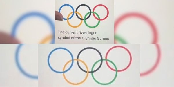
Spot the Mistake: Can You See What's Hilariously Off with the Aussie Olympics Logo That's Got Everyone Talking?
By
Danielle F.
- Replies 13
The Olympic Games are a time of national pride and unity, where we rally behind our athletes as they strive for gold on the world stage. The excitement is palpable, and every detail of the event is usually polished to perfection, including the iconic Olympic rings that symbolize the coming together of the five continents. But what happens when a detail as crucial as the Olympic logo gets a questionable makeover?
This is the question that TikTok creator Kiki, or @kiandratrickett, posed to her 96k followers when she noticed something amiss with the Australian broadcaster's take on the Olympic logo. In a video that has since gone viral with over 180k views, Kiki humorously points out a glaring error that has left viewers both amused and bewildered.
'Did I just miss an Olympic ring rebrand?' Kiki jests as she begins her video, highlighting the differences between the classic Olympic logo and the one featured on the home screen of 9Now, the official broadcaster of the 2024 Olympic Games. The original logo, which has been a symbol of the Games since 1913, features five interlocking rings of equal thickness, each representing one of the world's continents. However, the logo displayed by Nine had rings that were noticeably thinner and layered instead of interlocked, a deviation from the traditional design that did not go unnoticed.
'I think your designer has just created five circles that aren't the logo,' Kiki chuckles, expressing the confusion many of us would feel upon seeing such a fundamental symbol altered. The comments section of her post quickly filled with witty remarks and playful banter. Some joked that the logo looked like the work of an intern or a primary school project created in Microsoft Paint. Others quipped that the rings had been on a diet, referencing the weight-loss medication Ozempic, known for its slimming effects.
'They don’t 'interlock' at all, you can see that each circle is just laid over the other one going from right to left,' one viewer pointed out, while another highlighted the incorrect positioning of the yellow and green rings in relation to the black one. The jokes continued, with one follower humorously suggesting that even the Olympics were feeling the pinch of the cost of living crisis, hence the 'tightened' rings.
It's a relatable moment for all of us who have ever spotted a mistake that, once seen, cannot be unseen. It's a reminder that even in the most prestigious of events, errors can slip through the cracks. Yahoo Lifestyle reached out to Nine for comment, but as of yet, there has been no official response to the logo mishap.
At the Seniors Discount Club, we understand the importance of attention to detail, especially when it comes to representing a legacy as significant as the Olympics. It's a lesson in the value of double-checking our work, whether it's a global broadcast or a family newsletter. And while we can all have a good laugh at these little blunders, they also serve as a testament to the power of community observation – nothing gets past the watchful eyes of the public.

So, dear members, have you ever caught a funny or glaring error like this one? Share your stories with us in the comments below, and let's celebrate the perfection in imperfection together. After all, it's these little quirks that often make for the most memorable moments.
This is the question that TikTok creator Kiki, or @kiandratrickett, posed to her 96k followers when she noticed something amiss with the Australian broadcaster's take on the Olympic logo. In a video that has since gone viral with over 180k views, Kiki humorously points out a glaring error that has left viewers both amused and bewildered.
'Did I just miss an Olympic ring rebrand?' Kiki jests as she begins her video, highlighting the differences between the classic Olympic logo and the one featured on the home screen of 9Now, the official broadcaster of the 2024 Olympic Games. The original logo, which has been a symbol of the Games since 1913, features five interlocking rings of equal thickness, each representing one of the world's continents. However, the logo displayed by Nine had rings that were noticeably thinner and layered instead of interlocked, a deviation from the traditional design that did not go unnoticed.
'I think your designer has just created five circles that aren't the logo,' Kiki chuckles, expressing the confusion many of us would feel upon seeing such a fundamental symbol altered. The comments section of her post quickly filled with witty remarks and playful banter. Some joked that the logo looked like the work of an intern or a primary school project created in Microsoft Paint. Others quipped that the rings had been on a diet, referencing the weight-loss medication Ozempic, known for its slimming effects.
'They don’t 'interlock' at all, you can see that each circle is just laid over the other one going from right to left,' one viewer pointed out, while another highlighted the incorrect positioning of the yellow and green rings in relation to the black one. The jokes continued, with one follower humorously suggesting that even the Olympics were feeling the pinch of the cost of living crisis, hence the 'tightened' rings.
It's a relatable moment for all of us who have ever spotted a mistake that, once seen, cannot be unseen. It's a reminder that even in the most prestigious of events, errors can slip through the cracks. Yahoo Lifestyle reached out to Nine for comment, but as of yet, there has been no official response to the logo mishap.
At the Seniors Discount Club, we understand the importance of attention to detail, especially when it comes to representing a legacy as significant as the Olympics. It's a lesson in the value of double-checking our work, whether it's a global broadcast or a family newsletter. And while we can all have a good laugh at these little blunders, they also serve as a testament to the power of community observation – nothing gets past the watchful eyes of the public.
Key Takeaways
- A TikTok creator identified a glaring error in the Olympic logo used by Nine, the official broadcaster of the 2024 Olympic Games.
- The logo displayed on Nine's 9Now platform had rings that were much thinner and layered incorrectly, in contrast to the official logo where the rings are interlocked.
- The video highlighting the mistake went viral, receiving over 180k views and numerous comments joking about the logo’s appearance.
- Yahoo Lifestyle has approached Nine for a statement regarding the Olympic logo error displayed on their platform.


