See the detail in Woolworths' new displays that has shoppers up in arms - Is it ageist?
- Replies 32
When it comes to grocery shopping, many of us just want to get in, grab what we need and get out again.
We don't like to spend too long in the aisles – it’s generally easier (and more fun) to get the shopping done as quickly as possible so we can move on to other things. But now, thanks to a controversial change, it’s getting even more difficult to cut grocery shopping times.
Woolworths has been experimenting with installing digital shelf labels in select stores nationwide, replacing large paper price tickets.
In a bid to save both staff resources and paper, Woolworths has been trialling the introduction of electronic shelf labels. This also allows supermarket staff to spend more time serving customers’ needs.
However, one shopper took to the popular social media site Twitter to voice their concerns about the change, claiming that the labels were too small and difficult to read.
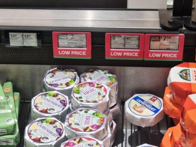
The photo the customer attached to the post shows several of the new electronic tags in the ‘Can't read the essential information in this display at Nundah store,’ they wrote in their post and tagged the supermarket giant.
In it, a row of the new tags can be seen featuring a tiny font. Even worse, several price tags were squeezed together into one digital screen – making them even harder to read.
Woolworths responded to the shopper’s complaint immediately and said that they are taking customer feedback amid the rollout of the new electronic displays.
‘Thanks for reaching out to us about the display in our store. We appreciate you sharing the image and bringing this to our attention,’ the retailer said in response to the post.
They also asked the shopper to confirm the name of the store so they can share the feedback with the store’s management team.
When the shopper didn’t respond to Woolworths, the retailer followed up on the incident.
They said: ‘Hi there, we’d still like to hear from you about this. We look forward to your reply soon. Thanks.’
A spokesperson from Woolworths said the supermarket is keen to hear customer feedback on their new electronic price tags.
‘Last year, we began trialling electronic shelf labels in select stores,’ they told reporters.
They added that aside from reducing paper, the electronic labels were also designed to update the latest prices and specials in real-time and reduce manual ticketing. This feature lets their staff members focus on replenishing shelves or serving customers in stores quickly.
‘We’ll continue to gather more feedback in the coming months,’ they said.
The electronic price tags sparked a bit of controversy when they were introduced early last year. Shoppers who have encountered them in Woolies’ stores said the signs were ‘really hard to see’. Some were supportive of the supermarket’s decision to replace the old tags since the new ones won’t get ‘ripped off’ and it made it easier to identify which items were on sale.
However, many pointed out that the new tags were not ‘disability-friendly’, especially for those who are colour-blind or have poor eyesight.
To ensure customer satisfaction, the size and placement of labels should be clear and must make the pricing, product information and other details easily visible.
According to one study, the Helvetica font type was shown to be more readable than Times New Roman or Goudy. Bold-typed texts were more readable than normal ones, and labels printed in 10-point size were more ‘reader-friendly’ than in 8-point size. Hopefully, Woolworths takes this into account before rolling out further price tags.
 Members, what do you think of Woolworths’ digital display tags? Share your thoughts with us in the comments!
We don't like to spend too long in the aisles – it’s generally easier (and more fun) to get the shopping done as quickly as possible so we can move on to other things. But now, thanks to a controversial change, it’s getting even more difficult to cut grocery shopping times.
Woolworths has been experimenting with installing digital shelf labels in select stores nationwide, replacing large paper price tickets.
In a bid to save both staff resources and paper, Woolworths has been trialling the introduction of electronic shelf labels. This also allows supermarket staff to spend more time serving customers’ needs.
However, one shopper took to the popular social media site Twitter to voice their concerns about the change, claiming that the labels were too small and difficult to read.
The photo the customer attached to the post shows several of the new electronic tags in the ‘Can't read the essential information in this display at Nundah store,’ they wrote in their post and tagged the supermarket giant.
In it, a row of the new tags can be seen featuring a tiny font. Even worse, several price tags were squeezed together into one digital screen – making them even harder to read.
Woolworths responded to the shopper’s complaint immediately and said that they are taking customer feedback amid the rollout of the new electronic displays.
‘Thanks for reaching out to us about the display in our store. We appreciate you sharing the image and bringing this to our attention,’ the retailer said in response to the post.
They also asked the shopper to confirm the name of the store so they can share the feedback with the store’s management team.
When the shopper didn’t respond to Woolworths, the retailer followed up on the incident.
They said: ‘Hi there, we’d still like to hear from you about this. We look forward to your reply soon. Thanks.’
A spokesperson from Woolworths said the supermarket is keen to hear customer feedback on their new electronic price tags.
‘Last year, we began trialling electronic shelf labels in select stores,’ they told reporters.
They added that aside from reducing paper, the electronic labels were also designed to update the latest prices and specials in real-time and reduce manual ticketing. This feature lets their staff members focus on replenishing shelves or serving customers in stores quickly.
‘We’ll continue to gather more feedback in the coming months,’ they said.
The electronic price tags sparked a bit of controversy when they were introduced early last year. Shoppers who have encountered them in Woolies’ stores said the signs were ‘really hard to see’. Some were supportive of the supermarket’s decision to replace the old tags since the new ones won’t get ‘ripped off’ and it made it easier to identify which items were on sale.
However, many pointed out that the new tags were not ‘disability-friendly’, especially for those who are colour-blind or have poor eyesight.
To ensure customer satisfaction, the size and placement of labels should be clear and must make the pricing, product information and other details easily visible.
According to one study, the Helvetica font type was shown to be more readable than Times New Roman or Goudy. Bold-typed texts were more readable than normal ones, and labels printed in 10-point size were more ‘reader-friendly’ than in 8-point size. Hopefully, Woolworths takes this into account before rolling out further price tags.
Key Takeaways
- Woolworths has been trialling digital shelf labels to reduce paper and save staff time.
- A shopper has taken aim at Woolworths over some of the labels, who said that they are too small and difficult to read.
- An image shared by the customer shows several of the tags squeezed into one digital screen.
- A Woolworths spokesperson said the supermarket is keen to hear customer feedback on the matter.


