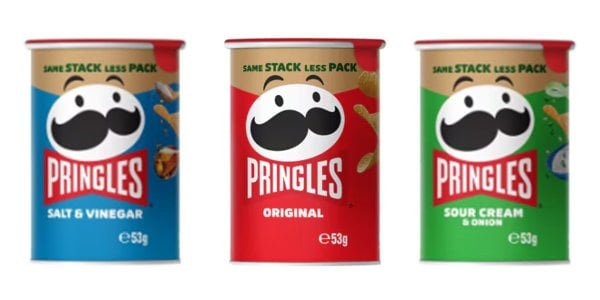
Same snack, less pack! Pringles undergo massive transformation
By
KenAlunan
- Replies 16
Pringles, with their unique shape, satisfying crunch, and flavours ranging from classic to downright wild, are a go-to snack for just about everyone.
Despite their iconic status, the Pringles can is set to undergo a significant change that will have environmentalists cheering and traditionalists doing a double-take.
Pringles has announced that it will reduce the size of its 53g can, but before you jump to conclusions about ‘shrinkflation’, rest assured that the amount of chips inside will remain the same.
This fact is highlighted on the can with the text ‘same stack, less pack’.
The can's height will be trimmed by nearly 10 per cent, and it’s expected to save an impressive 37,000 square kilograms of packaging waste annually in Australia and New Zealand.
To put that into perspective, that's the equivalent of 30 million Pringles chips!
This initiative is part of a broader commitment by Pringles' parent company, Kellogg's, to reduce its environmental impact.
Dan Bitti, Kellogg's Head of Salty Snacks, said, ‘Pringles have a distinctive and iconic can, and we’re committed to maintaining quality while continuing to find ways to minimise our environmental footprint.’
‘We’re excited to introduce revamped cans delivering the same snack with less packaging.’
The change is a bold step towards sustainability, especially considering the Pringles can's long-standing design cherished by many of its loyal customers.
In 2022, Pringles moved towards sustainability by removing the plastic lid from the 53g can.
This was a precursor to the latest announcement, signalling a series of upcoming changes to make the entire Pringles range more eco-friendly.
However, not all changes have been met with open arms.
In 2021, Pringles updated its iconic moustache man logo for the first time in 20 years, and the reaction from customers was mixed, to say the least.
The new logo featured a more modern look, with a sleek black moustache and sculpted eyebrows, a stark contrast to the classic, bushy brown facial hair that had become synonymous with the brand.
One fan said the new logo looked like ‘a copy version you’d expect to see at ALDI’ or a ‘bartender in a hipster speak-easy’.
Another fan said, ‘If I got to hell, whoever changed the Pringles logo better be there too.’
Despite the mixed reactions to the logo redesign, Pringles is moving forward with its environmental initiatives.
The 'same stack, less pack' cans are set to hit the shelves of all major supermarkets in May, marking a new chapter for the snack that has become a staple in Australian homes.
Although Kellogg's has assured customers that this reduction in packaging size won't result in fewer chips per pack, this isn’t the first time shoppers have criticised Pringles for 'shrinkflation'. You can read more about the story here.
 What do you feel about the Pringles can redesign? Do you have any tips on reducing packaging waste at home? Let us know in the comments below!
Despite their iconic status, the Pringles can is set to undergo a significant change that will have environmentalists cheering and traditionalists doing a double-take.
Pringles has announced that it will reduce the size of its 53g can, but before you jump to conclusions about ‘shrinkflation’, rest assured that the amount of chips inside will remain the same.
This fact is highlighted on the can with the text ‘same stack, less pack’.
The can's height will be trimmed by nearly 10 per cent, and it’s expected to save an impressive 37,000 square kilograms of packaging waste annually in Australia and New Zealand.
To put that into perspective, that's the equivalent of 30 million Pringles chips!
This initiative is part of a broader commitment by Pringles' parent company, Kellogg's, to reduce its environmental impact.
Dan Bitti, Kellogg's Head of Salty Snacks, said, ‘Pringles have a distinctive and iconic can, and we’re committed to maintaining quality while continuing to find ways to minimise our environmental footprint.’
‘We’re excited to introduce revamped cans delivering the same snack with less packaging.’
The change is a bold step towards sustainability, especially considering the Pringles can's long-standing design cherished by many of its loyal customers.
In 2022, Pringles moved towards sustainability by removing the plastic lid from the 53g can.
This was a precursor to the latest announcement, signalling a series of upcoming changes to make the entire Pringles range more eco-friendly.
However, not all changes have been met with open arms.
In 2021, Pringles updated its iconic moustache man logo for the first time in 20 years, and the reaction from customers was mixed, to say the least.
The new logo featured a more modern look, with a sleek black moustache and sculpted eyebrows, a stark contrast to the classic, bushy brown facial hair that had become synonymous with the brand.
One fan said the new logo looked like ‘a copy version you’d expect to see at ALDI’ or a ‘bartender in a hipster speak-easy’.
Another fan said, ‘If I got to hell, whoever changed the Pringles logo better be there too.’
Despite the mixed reactions to the logo redesign, Pringles is moving forward with its environmental initiatives.
The 'same stack, less pack' cans are set to hit the shelves of all major supermarkets in May, marking a new chapter for the snack that has become a staple in Australian homes.
Although Kellogg's has assured customers that this reduction in packaging size won't result in fewer chips per pack, this isn’t the first time shoppers have criticised Pringles for 'shrinkflation'. You can read more about the story here.
Key Takeaways
- Pringles is set to shrink the size of its 53g cans in Australia, reducing the height by close to 10 per cent.
- Despite the reduced can size, the same amount of chips will remain inside, aiming to minimise packaging waste significantly.
- This initiative is part of the brand's commitment to minimising its environmental footprint, following the removal of the plastic lid in 2022.
- Some Pringles fans have previously expressed dissatisfaction with changes to the brand's logo, likening it to a budget version or a 'hipster' redesign.


