Do you know the history (and hidden meaning) behind the iconic ALDI logo?
- Replies 10
Whether you're a dedicated bargain hunter or a more occasional visitor, chances are that you've done more than a few shops at ALDI over the years - whether online, in-store or even at your friendly neighbourhood grocery store!
But, while you may already be familiar with their fantastic selection of affordable, quality groceries, have you ever stopped to think about the origins of their iconic logo and colour theme?
And have you ever wondered how this discount superstore has become such an integral part of Australian supermarket shopping?
Believe it or not, the company's history of unbeatable savings stretches all the way back to 1945, when the Albrecht brothers (Karl and Theo) inherited their mother's small store in Germany.
Just five years later, the two business-savvy brothers had expanded to 13 stores. Their secret? Shunning advertising, avoiding unsaleable goods, and stocking their stores with as many sellable items as possible onto their condensed selling floors.
In 1960, the brothers split the company due to a disagreement over the sale of cigarettes, bringing the total number of stores to 300.
Two years later, the company was renamed 'ALDI' (AL and DI for the two words: Albrecht and Discount) and then divided fully into ALDI Nord and ALDI Süd, both legally and financially.
By 1967, the company had gone international, carving a place for itself in countries across the world - and with it, the brand and its logo also became more well-known worldwide.
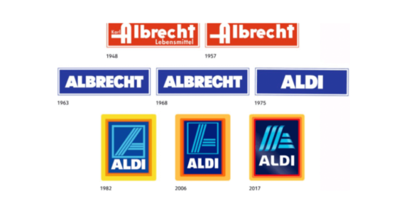
The inspirational symbol, with its distinct colour palette, was initially designed in 1970 and has been slowly tweaked over the years to the logo we know and love today.
So, what does the ALDI logo mean?
In the simplest terms, the logo is a reflection of the brand's core values - austerity, smart savings and the easy shopping journey. The size is designed to be kept small to ensure the business won't cut into its customers' savings.
The colour choice is indicative of the brand's determination to stand out without compromising on its core values (It was assumed that orange, as a colour to attract attention, and red was considered the original colour of ALDI).
Meanwhile, the design of the letter 'A' has often been seen to represent boldness, progress and direction. According to experts, this symbolism represents a forward movement for the company (a similar technique is used by some airlines and the automobile segment as a picture of the way or the road).
Of course, the company's logo also speaks to the good corporate attitude ALDI has taken since the beginning, using a maximum bold typeface in white letters on a dark blue rectangle.
With the company avoiding the use of outside advertising agencies and instead opting for weekly information booklets, ALDI resonates with its customers more than your average store – and customers trust its logo.
As of 2017, ALDI slightly enhanced its style by introducing a 3D gradient and softer lines into their iconic blue 'A'. The three-framing border was also retained, although this has been criticised by designers as one of the more 'difficult-to-read' logos in mobile devices due to its overly complex style.
Nevertheless, ALDI's logo is one of the most iconic symbols in the grocery market and one that clearly represents their message – no frills, no fuss, just competitively low prices and the freshest goods.

Exploring the Psychology of Brand Logos
Don't be fooled into thinking that logos are just an afterthought for companies. In fact, the psychology behind their design can teach us a great deal about how these businesses influence their consumers.
The ALDI logo is no exception.
These psychological triggers are implemented to aim for a variety of goals, such as building trust, creating familiarity, and driving loyalty.
Being one of the largest discount retail stores in the world, it makes sense that ALDI's logo is designed as such; it's a way of communicating its values and mission right at the forefront of its branding.
Logo design has long been used as a tool for marketing, and the ALDI logo is a perfect example of how shrewd, effective design can resonate with consumers and make a real, lasting impact.
Have you ever noticed the ALDI logo before? The next time you do your groceries in an ALDI store, why not take a few minutes to appreciate the iconic ALDI logo and its hidden fanfare? We'd love to hear your thoughts in the comments below!
ALDI isn't the only company whose logo is instantly recognisable by customers; there are many more like it in the world. But what, exactly, is it about these logos that make them so great? In order to get a better understanding, watch the video below:
Credit: Vox.
But, while you may already be familiar with their fantastic selection of affordable, quality groceries, have you ever stopped to think about the origins of their iconic logo and colour theme?
And have you ever wondered how this discount superstore has become such an integral part of Australian supermarket shopping?

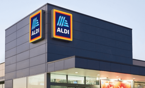
Did you know that the ALDI logo itself has an intriguing story behind it? Credit: Facebook/ALDI Australia.
Believe it or not, the company's history of unbeatable savings stretches all the way back to 1945, when the Albrecht brothers (Karl and Theo) inherited their mother's small store in Germany.
Just five years later, the two business-savvy brothers had expanded to 13 stores. Their secret? Shunning advertising, avoiding unsaleable goods, and stocking their stores with as many sellable items as possible onto their condensed selling floors.
In 1960, the brothers split the company due to a disagreement over the sale of cigarettes, bringing the total number of stores to 300.
Two years later, the company was renamed 'ALDI' (AL and DI for the two words: Albrecht and Discount) and then divided fully into ALDI Nord and ALDI Süd, both legally and financially.
By 1967, the company had gone international, carving a place for itself in countries across the world - and with it, the brand and its logo also became more well-known worldwide.
The inspirational symbol, with its distinct colour palette, was initially designed in 1970 and has been slowly tweaked over the years to the logo we know and love today.
So, what does the ALDI logo mean?
In the simplest terms, the logo is a reflection of the brand's core values - austerity, smart savings and the easy shopping journey. The size is designed to be kept small to ensure the business won't cut into its customers' savings.
The colour choice is indicative of the brand's determination to stand out without compromising on its core values (It was assumed that orange, as a colour to attract attention, and red was considered the original colour of ALDI).
Meanwhile, the design of the letter 'A' has often been seen to represent boldness, progress and direction. According to experts, this symbolism represents a forward movement for the company (a similar technique is used by some airlines and the automobile segment as a picture of the way or the road).

The ALDI logo has undergone design changes in recent times to keep up with changing tastes and styles. Credit: ALDI Australia.
Of course, the company's logo also speaks to the good corporate attitude ALDI has taken since the beginning, using a maximum bold typeface in white letters on a dark blue rectangle.
With the company avoiding the use of outside advertising agencies and instead opting for weekly information booklets, ALDI resonates with its customers more than your average store – and customers trust its logo.
As of 2017, ALDI slightly enhanced its style by introducing a 3D gradient and softer lines into their iconic blue 'A'. The three-framing border was also retained, although this has been criticised by designers as one of the more 'difficult-to-read' logos in mobile devices due to its overly complex style.
Nevertheless, ALDI's logo is one of the most iconic symbols in the grocery market and one that clearly represents their message – no frills, no fuss, just competitively low prices and the freshest goods.
Key Takeaways
- The origins of the ALDI logo go back to 1913 when Anna Albrecht opened a small food store in Germany.
- The original logo featured the 'Albrecht' name in white lettering on a red background but was redesigned in 1962 to feature the word 'Albrecht' in white on a blue background.
- The tricolour border of orange, red, and yellow was added in 1982, and the 'A' symbol also appeared on the logo at that time.
- Up until 2006, the logo featured thin white lines representing a way or a road, which was a visual representation of the company's progressive attitude.
- In 2017, the logo was transformed into a 3D symbol with rounded edges and a gradient in the blue letter 'A'. This has caused debate among experts as to the legitimacy of this design when viewed on mobile devices.
Don't be fooled into thinking that logos are just an afterthought for companies. In fact, the psychology behind their design can teach us a great deal about how these businesses influence their consumers.
The ALDI logo is no exception.
These psychological triggers are implemented to aim for a variety of goals, such as building trust, creating familiarity, and driving loyalty.
Being one of the largest discount retail stores in the world, it makes sense that ALDI's logo is designed as such; it's a way of communicating its values and mission right at the forefront of its branding.
Logo design has long been used as a tool for marketing, and the ALDI logo is a perfect example of how shrewd, effective design can resonate with consumers and make a real, lasting impact.
Have you ever noticed the ALDI logo before? The next time you do your groceries in an ALDI store, why not take a few minutes to appreciate the iconic ALDI logo and its hidden fanfare? We'd love to hear your thoughts in the comments below!
ALDI isn't the only company whose logo is instantly recognisable by customers; there are many more like it in the world. But what, exactly, is it about these logos that make them so great? In order to get a better understanding, watch the video below:
Credit: Vox.

