Bunnings' logo reveals a surprising secret — can you spot it?
- Replies 13
For those of us who fancy ourselves as do-it-yourself enthusiasts, Bunnings Warehouse has long been a staple for home improvement shopping. Yet, a hidden detail within the familiar Bunnings logo has left many Australians puzzled and wondering how they could have missed it.
Let's look at the Bunnings Warehouse logo that we all know so well – the green square displaying the words 'Bunnings Warehouse', with 'Warehouse' enclosed in a red box.
But have you ever noticed that there are a few things subtly hidden within the logo?
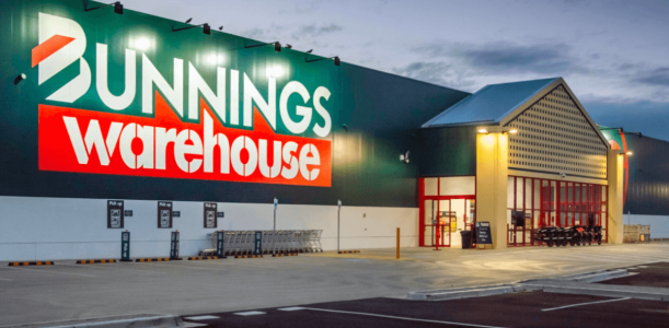
It's amazing how the little things can go unnoticed until someone points them out, isn't it? Well, that's exactly what happened here. It turns out that the red triangles above the word 'Warehouse' aren't just random shapes - they're actually houses!
People have taken to Twitter to express their surprise at this hidden detail. One person even admitted to feeling like they've been living under a rock for the past 30 years because they had never noticed it before.
Another customer, who's been a regular at Bunnings for years, suddenly couldn't ‘unsee’ the hidden houses.
Some have even proposed that the red triangles represent a warehouse with three sloping roofs. Either way, it's fascinating to see how a seemingly simple logo design can hold so much meaning and intrigue.
Whether you can now see houses, a warehouse, or perhaps a mix of both, one thing's for sure – we'll all be looking a little bit closer at the Bunnings logo the next time we visit!

History of the Bunnings logo
According to the design experts at 1000Logos, Bunnings has always kept its visual identity simple and modest. Their logo has primarily focused on the wordmark, using no more than three colours and keeping the name as the main highlight.
The original Bunnings logo, which was introduced in 1952 to commemorate the company's transition to a public company, featured a horizontally stretched oval shape with a thick orange outline. The background was dark grey, and the lettering was in white, using a bold italicised sans-serif font with traditional shapes and thick lines.
The Bunnings logo underwent a redesign in 1991, giving the company a fresher and sharper visual identity. The new logo incorporated a green, white, and red colour palette and featured clean and edgy lines in the logotype. The only graphical element was the letter 'B', which was all green and had two diagonal lines - one red and one white.
When Bunnings opened its first Warehouse in 1994, a new logo was designed specifically for it. This logo featured the same logotype as the official version but with the addition of a solid red banner and a white 'Warehouse' inscription in lowercase.
The bold stencil sans-serif lettering looked powerful and professional, welcoming buyers and conveying a sense of strength and capability.
According to the experts at 1000Logos, the green, white, and red colour palette of the Bunnings visual identity is not only delightful and juicy, but it also represents the company's core values of growth, success, and loyalty. The logo's energetic and joyful design makes it stand out and leaves a lasting impression on customers.

If you're intrigued by the hidden details in logos, you're not alone — and Bunnings is just one example of a major brand that has caught the attention of eagle-eyed observers. In fact, many other supermarkets, retailers, and brands have also come under the spotlight for the cleverly hidden elements in their visual identity.
If you're curious to learn more about these fascinating details, feel free to check out our previous articles. You might be surprised to discover the design elements that are hiding in plain sight in some of your favourite logos.
It's always fascinating to discover hidden details in something you thought you knew so well. Who knows, maybe there are even more secrets waiting to be uncovered in other everyday designs we take for granted.
So, let's all keep our eyes peeled and see what other surprises we can find. Happy exploring!
Let's look at the Bunnings Warehouse logo that we all know so well – the green square displaying the words 'Bunnings Warehouse', with 'Warehouse' enclosed in a red box.
But have you ever noticed that there are a few things subtly hidden within the logo?

An easy-to-miss detail in the Bunnings Warehouse logo has left many Aussie shoppers stumped. Credit: Bunnings.
It's amazing how the little things can go unnoticed until someone points them out, isn't it? Well, that's exactly what happened here. It turns out that the red triangles above the word 'Warehouse' aren't just random shapes - they're actually houses!
People have taken to Twitter to express their surprise at this hidden detail. One person even admitted to feeling like they've been living under a rock for the past 30 years because they had never noticed it before.
Another customer, who's been a regular at Bunnings for years, suddenly couldn't ‘unsee’ the hidden houses.
Some have even proposed that the red triangles represent a warehouse with three sloping roofs. Either way, it's fascinating to see how a seemingly simple logo design can hold so much meaning and intrigue.
Whether you can now see houses, a warehouse, or perhaps a mix of both, one thing's for sure – we'll all be looking a little bit closer at the Bunnings logo the next time we visit!

The Bunnings logo never used more than three colours and had an accent on the name as the main target. Credit: 1000logos.net.
History of the Bunnings logo
According to the design experts at 1000Logos, Bunnings has always kept its visual identity simple and modest. Their logo has primarily focused on the wordmark, using no more than three colours and keeping the name as the main highlight.
The original Bunnings logo, which was introduced in 1952 to commemorate the company's transition to a public company, featured a horizontally stretched oval shape with a thick orange outline. The background was dark grey, and the lettering was in white, using a bold italicised sans-serif font with traditional shapes and thick lines.
The Bunnings logo underwent a redesign in 1991, giving the company a fresher and sharper visual identity. The new logo incorporated a green, white, and red colour palette and featured clean and edgy lines in the logotype. The only graphical element was the letter 'B', which was all green and had two diagonal lines - one red and one white.
When Bunnings opened its first Warehouse in 1994, a new logo was designed specifically for it. This logo featured the same logotype as the official version but with the addition of a solid red banner and a white 'Warehouse' inscription in lowercase.
The bold stencil sans-serif lettering looked powerful and professional, welcoming buyers and conveying a sense of strength and capability.
According to the experts at 1000Logos, the green, white, and red colour palette of the Bunnings visual identity is not only delightful and juicy, but it also represents the company's core values of growth, success, and loyalty. The logo's energetic and joyful design makes it stand out and leaves a lasting impression on customers.
Key Takeaways
- Bunnings' logo has a hidden detail that many Australians have overlooked - three houses that are subtly hidden in the red triangles above the word 'Warehouse'.
- The logo has gone through several redesigns, with the current version featuring a green, white, and red colour palette and clean, edgy lines in the logotype.
- The logo's simple yet effective design reflects the company's core values of growth, success, and loyalty, making it a memorable visual identity for customers.
If you're intrigued by the hidden details in logos, you're not alone — and Bunnings is just one example of a major brand that has caught the attention of eagle-eyed observers. In fact, many other supermarkets, retailers, and brands have also come under the spotlight for the cleverly hidden elements in their visual identity.
If you're curious to learn more about these fascinating details, feel free to check out our previous articles. You might be surprised to discover the design elements that are hiding in plain sight in some of your favourite logos.
- Do you know the surprising secret behind Australia Post's logo?
- The 'hidden' detail in Woolworths logo that has shoppers intrigued
- Do you know the history (and hidden meaning) behind the iconic ALDI logo?
- Can you spot the secret image hidden in the Great Northern logo?
It's always fascinating to discover hidden details in something you thought you knew so well. Who knows, maybe there are even more secrets waiting to be uncovered in other everyday designs we take for granted.
So, let's all keep our eyes peeled and see what other surprises we can find. Happy exploring!


