‘Wow…surely that’s a print error!’: This street sign is sparking outrage online
By
Maan
- Replies 0
Street signs are meant to provide clear instructions, yet sometimes they seem to do the exact opposite.
One particular sign has sparked confusion and frustration, leaving locals questioning whether it’s a simple mistake or something more concerning.
Now, a heated debate has erupted, with some calling it an oversight while others suspect a deliberate design choice.
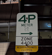
A Brisbane resident sparked a heated discussion online after sharing a baffling street sign that many believed was almost impossible to read.
The image, posted on social media, showed a sign with ‘4P meter’ in large, clear letters.
However, the crucial details underneath—covering parking restrictions—were printed in such tiny font that people questioned how anyone could read them while driving.
‘Street parking signs with absurdly small font. Is this potentially deliberate??’ the user captioned the post.
The post quickly attracted attention, with many sharing their own frustrations about confusing parking signs.
‘Apparently, we are supposed to be able to read it from the driver’s seat doing 40km/hr, no stopping,’ one person wrote.
‘Brisbane’s parking signs are already bogus enough as it is,’ another added.
Some described situations where they had encountered multiple conflicting signs on a single pole, making it nearly impossible to determine the correct parking rules.
‘I'm often confronted with 4 signs on one pole specifying 4 sets of rules for different hours on different days. You're expected to decipher them all whilst operating a moving, deadly vehicle,’ a commenter wrote.
Many believed the tiny font must have been a mistake rather than an intentional design.
‘Wow…surely that’s a print error! I’ve worked in projects that require signage, and it’s all standardised by BSD (Brisbane Standard Drawings)...that doesn’t look like one I’ve ever seen,’ one person noted.
Another agreed, saying: ‘That’s definitely an error. There would be guidelines on minimum font size for accessibility.’
‘Signwriter made a booboo. The zone portion of the sign is too big and it’s throwing out the size of the signs. Report it and you will see this corrected in a few weeks,’ someone else suggested.
Others, however, believed the small text was deliberate.
‘They’ve deliberately made it small so they can cram lots onto the sign. I don’t think they’re doing it to trick people into parking there,’ a user argued.
Another person proposed a better solution: ‘They *should* have made a new format that has a yellow border indicating (without writing) “Resident Permits Excepted” because there aren’t that many local residents and they can be independently informed about the meaning of the yellow border etc.’
While the debate continued, some dismissed the issue altogether, saying it wasn’t as bad as people were making it out to be.
‘Is the font size of the hours/days component far too small? Hell yes. But it is merely an inconvenience and not going to stop you from deciphering it,’ one commenter said.
‘Honestly, this doesn’t matter. It’s pay by meter, so you either pay, or the meter lets you know when it’s free. It’s not like it turns into a clearway at midnight,’ another added.
Brisbane City Council responded to the controversy, confirming they were aware of the issue and would be taking steps to address it.
‘We have heard the concerns of residents and will update the sign as soon as possible to make sure it can easily be read by everyone,’ a spokesperson said.

Have you ever struggled to decipher confusing parking rules? Let us know your thoughts in the comments.
One particular sign has sparked confusion and frustration, leaving locals questioning whether it’s a simple mistake or something more concerning.
Now, a heated debate has erupted, with some calling it an oversight while others suspect a deliberate design choice.
A Brisbane resident sparked a heated discussion online after sharing a baffling street sign that many believed was almost impossible to read.
The image, posted on social media, showed a sign with ‘4P meter’ in large, clear letters.
However, the crucial details underneath—covering parking restrictions—were printed in such tiny font that people questioned how anyone could read them while driving.

‘Street parking signs with absurdly small font. Is this potentially deliberate??’ the user captioned the post.
The post quickly attracted attention, with many sharing their own frustrations about confusing parking signs.
‘Apparently, we are supposed to be able to read it from the driver’s seat doing 40km/hr, no stopping,’ one person wrote.
‘Brisbane’s parking signs are already bogus enough as it is,’ another added.
Some described situations where they had encountered multiple conflicting signs on a single pole, making it nearly impossible to determine the correct parking rules.
‘I'm often confronted with 4 signs on one pole specifying 4 sets of rules for different hours on different days. You're expected to decipher them all whilst operating a moving, deadly vehicle,’ a commenter wrote.
Many believed the tiny font must have been a mistake rather than an intentional design.
‘Wow…surely that’s a print error! I’ve worked in projects that require signage, and it’s all standardised by BSD (Brisbane Standard Drawings)...that doesn’t look like one I’ve ever seen,’ one person noted.
Another agreed, saying: ‘That’s definitely an error. There would be guidelines on minimum font size for accessibility.’
‘Signwriter made a booboo. The zone portion of the sign is too big and it’s throwing out the size of the signs. Report it and you will see this corrected in a few weeks,’ someone else suggested.
Others, however, believed the small text was deliberate.
‘They’ve deliberately made it small so they can cram lots onto the sign. I don’t think they’re doing it to trick people into parking there,’ a user argued.
Another person proposed a better solution: ‘They *should* have made a new format that has a yellow border indicating (without writing) “Resident Permits Excepted” because there aren’t that many local residents and they can be independently informed about the meaning of the yellow border etc.’
While the debate continued, some dismissed the issue altogether, saying it wasn’t as bad as people were making it out to be.
‘Is the font size of the hours/days component far too small? Hell yes. But it is merely an inconvenience and not going to stop you from deciphering it,’ one commenter said.
‘Honestly, this doesn’t matter. It’s pay by meter, so you either pay, or the meter lets you know when it’s free. It’s not like it turns into a clearway at midnight,’ another added.
Brisbane City Council responded to the controversy, confirming they were aware of the issue and would be taking steps to address it.
‘We have heard the concerns of residents and will update the sign as soon as possible to make sure it can easily be read by everyone,’ a spokesperson said.
Key Takeaways
- A Brisbane resident shared an image of a confusing street sign with tiny, difficult-to-read text, sparking debate online.
- Many believed the small font was a mistake, with some pointing out that official signage standards should prevent such design errors.
- Others argued the size was intentional to fit more information, though some suggested better formatting could have avoided the issue.
- Brisbane City Council acknowledged the concerns and confirmed they would update the sign to improve readability.
Have you ever struggled to decipher confusing parking rules? Let us know your thoughts in the comments.