‘Tell me what you see’: Shopper’s theory behind Coles logo will blow your mind!
By
Seia Ibanez
- Replies 12
The world of branding and logos is a fascinating one, often filled with hidden meanings and subliminal messages.
This time, a Coles customer has sparked a debate on social media with her wild theory about the supermarket's iconic logo.
This theory has stunned many followers, with reactions ranging from disbelief to intrigue.
The Coles logo has been a symbol of the supermarket chain for decades. It features a red and orange ball, which, according to the eagle-eyed shopper, hides a shocking secret.
The customer, known as @sammymalcolm1 on social media, urged her followers to take a closer look at this seemingly innocuous part of the logo.
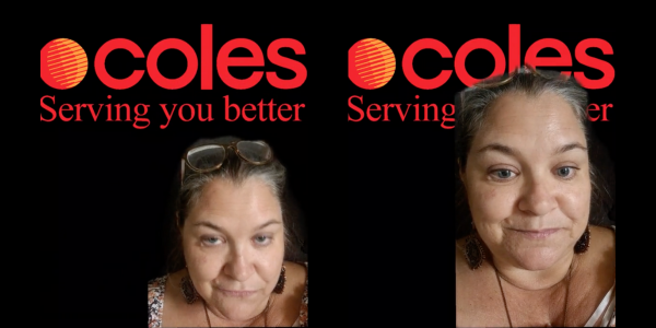
In a video she shared online, she pointed out the logo and said, 'OK, come here. I want you to look at that, up in the corner.’
‘“Coles Serving You Better”, and I want you to zoom in and have a good look at that circle up the top. Tell me what you see.'
She further added, 'We need this to go viral. We need to ask Coles what that is.'
The video quickly gained traction, with many followers chiming in with their interpretations.
One of the most shocking theories was that the ball contained a line of syringes.
'Look like syringes,' one social media user commented, to which the original poster replied, 'Sure does.'
This suggestion left many followers stunned, with one exclaiming, 'What?! No way!' and another echoing, 'Crazy, hey?'
You can watch the video below:
Credit: @sammymalcolm1 / TikTok
However, the red ball has a fascinating history of the supermarket’s origins with New World, which formed Coles’ brand for many years.
It was said that the red ball was the ‘last remnant of the “New World” branding, which ran from the 1960s to the 1990s’.
This isn't the first time a supermarket's logo has been the subject of intense scrutiny and debate on social media.
Last year, the Woolworths logo was at the centre of a similar controversy.
Many had long believed that the 'W' in the logo was simply the letter 'W', but it was revealed to be a pumpkin, leaving many social media users in disbelief.
However, other shoppers thought the logo was reminiscent of a toucan or another bird-like figure.
 What do you see in the Coles logo? Do you think there's a hidden message, or is it just a wild theory? Share your thoughts in the comments below!
This time, a Coles customer has sparked a debate on social media with her wild theory about the supermarket's iconic logo.
This theory has stunned many followers, with reactions ranging from disbelief to intrigue.
The Coles logo has been a symbol of the supermarket chain for decades. It features a red and orange ball, which, according to the eagle-eyed shopper, hides a shocking secret.
The customer, known as @sammymalcolm1 on social media, urged her followers to take a closer look at this seemingly innocuous part of the logo.

A Coles customer urged her followers on social media to look closely at the Coles logo. Credit: @sammymalcolm1 / TikTok
In a video she shared online, she pointed out the logo and said, 'OK, come here. I want you to look at that, up in the corner.’
‘“Coles Serving You Better”, and I want you to zoom in and have a good look at that circle up the top. Tell me what you see.'
She further added, 'We need this to go viral. We need to ask Coles what that is.'
The video quickly gained traction, with many followers chiming in with their interpretations.
One of the most shocking theories was that the ball contained a line of syringes.
'Look like syringes,' one social media user commented, to which the original poster replied, 'Sure does.'
This suggestion left many followers stunned, with one exclaiming, 'What?! No way!' and another echoing, 'Crazy, hey?'
You can watch the video below:
Credit: @sammymalcolm1 / TikTok
However, the red ball has a fascinating history of the supermarket’s origins with New World, which formed Coles’ brand for many years.
It was said that the red ball was the ‘last remnant of the “New World” branding, which ran from the 1960s to the 1990s’.
This isn't the first time a supermarket's logo has been the subject of intense scrutiny and debate on social media.
Last year, the Woolworths logo was at the centre of a similar controversy.
Many had long believed that the 'W' in the logo was simply the letter 'W', but it was revealed to be a pumpkin, leaving many social media users in disbelief.
However, other shoppers thought the logo was reminiscent of a toucan or another bird-like figure.
Key Takeaways
- A Coles customer shared a theory about the supermarket's logo, sparking debate on social media.
- The customer encouraged people to look closely at the red and orange ball in the Coles logo, questioning what it represents.
- One social media user suggested the ball looked like a line of syringes, which has sparked further conversation.
- The red ball was said to be the ‘last remnant’ of the New World branding, which ran from the 1960s to the 1990s.
- The intrigue into supermarket logos is not new, with a previous debate about the hidden detail in the Woolworths logo revealing many thought the 'W' was actually a pumpkin.

