Have you ever noticed this hidden detail in the Coles supermarket logo?

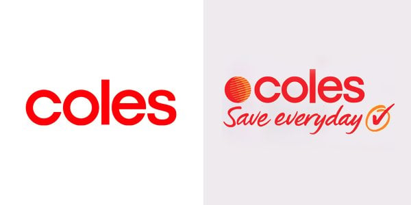
Even if you've been shopping at Coles for some time now, you might not have noticed something missing from the familiar red logo—the iconic red and orange ball that graced the supermarket's signage for decades.

But why the sudden disappearance of the red and orange 'orb'?


A recent post on social media pondered on this very question which led some nostalgic shoppers to share their theories.

'Why did Coles take the ball out of their logo anyway?' One asked.


photo (11).jpg
Coles has removed the red and orange ball in the latest version of their logo. Image sources: Coles (left), Reddit (right).


As it turns out, the red ball has a fascinating history tied to Coles' origins with New World, which formed the supermarket’s brand for many years.

'I feel it was the last remnant of the ‘New World’ branding, which ran from the 1960s to 1990s,' someone replied.

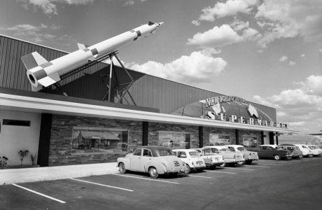
While another agreed and said: 'Absolutely. For those who don’t know, this is a picture of the first Coles supermarket, which Coles branded as and everyone called New World.'


SDC 22.png
Coles was branded as New World Supermarket in the early 1960s. Image source: Facebook/Old Dandenong.


'The space race was ramping up, people were hyped on the idea of “progress”, and the whole branding was based around that.’

'The concept of a butcher, grocer, and deli all being under one roof was considered extraordinary.’

'Coles New World wasn’t rebranded to Coles Supermarkets until 1991 when the circle/globe logo was added as a remnant.'


Other users chimed in and shared their theories, with one saying: 'Just a guess. Without graphics and extra colours, the logo is cheaper. Probably not by much, but times that by the millions of products, it probably adds up,'

'This is speculation only, but it just barely looks like the MasterCard logo. Maybe they dropped it to avoid confusion?' Another suggested.

One user asked: 'Do any stores still have this branding? Like Eastwood, NSW Woolworths still has the old Woolworths branding.'

'All modern logos have to be simplistic and boring now,' another commented.

And a third added: 'Love the ball. Always wondered about it.'


In other news, an eagle-eyed shopper pointed out an easy-to-miss detail on Chemist Warehouse’s sign that has left many users stunned.

On the front of many Chemist Warehouse stores, the store's slogans in their distinctive colours include 'Chemist Warehouse', 'Discount Chemist' and 'Australia’s Cheapest Chemist'.

‘Have you ever noticed that Chemist Warehouse has all those big signs saying “AUSTRALIA’S CHEAPEST CHEMIST!”’

‘But if you look closer, it has “is this?” in small writing before it,’ the shopper shared.

The tiny detail has stunned many social media users, with many sharing that they’ve never noticed it before.

You can read more about this here.
Key Takeaways
  • A detail in the evolution of the Coles supermarket logo has sparked curiosity among social media users.
  • The retailer made a significant change to its signage in recent years, dropping the iconic red and orange ball from its logo in favour of a more simple design.
  • Social media users shared theories about the change, with some suggesting it was linked to the supermarket's previous 'New World' branding.
  • Other suggested theories included cost-saving on graphics and potential confusion with the MasterCard logo, while some users expressed nostalgia for the old logo.
Members, have you also noticed any changes in certain brand logos in the past years? Share them with us in the comments below!
 
Sponsored
Have always noticed the Chemist Warehouse sign. Don't know why people make such a big deal out of it, they are by far the cheapest on most things, and you don't have to go there if you don't want to, nobody's twisting your arm.
I buy the majority of my things when they are 50% off, buy four at a time, before I have used them all they are 50% off again. Do the same with cosmetics, I buy L'Oreal, always get it ,50% off, I never pay full price for anything if I don't have to.
 
Maybe Coles simplified logo......represents its association with the 'NEW WORLD ORDER'....Circa 21st Century.🤔
 
Even if you've been shopping at Coles for some time now, you might not have noticed something missing from the familiar red logo—the iconic red and orange ball that graced the supermarket's signage for decades.

But why the sudden disappearance of the red and orange 'orb'?


A recent post on social media pondered on this very question which led some nostalgic shoppers to share their theories.

'Why did Coles take the ball out of their logo anyway?' One asked.


View attachment 31830
Coles has removed the red and orange ball in the latest version of their logo. Image sources: Coles (left), Reddit (right).


As it turns out, the red ball has a fascinating history tied to Coles' origins with New World, which formed the supermarket’s brand for many years.

'I feel it was the last remnant of the ‘New World’ branding, which ran from the 1960s to 1990s,' someone replied.

While another agreed and said: 'Absolutely. For those who don’t know, this is a picture of the first Coles supermarket, which Coles branded as and everyone called New World.'


View attachment 31831
Coles was branded as New World Supermarket in the early 1960s. Image source: Facebook/Old Dandenong.


'The space race was ramping up, people were hyped on the idea of “progress”, and the whole branding was based around that.’

'The concept of a butcher, grocer, and deli all being under one roof was considered extraordinary.’

'Coles New World wasn’t rebranded to Coles Supermarkets until 1991 when the circle/globe logo was added as a remnant.'


Other users chimed in and shared their theories, with one saying: 'Just a guess. Without graphics and extra colours, the logo is cheaper. Probably not by much, but times that by the millions of products, it probably adds up,'

'This is speculation only, but it just barely looks like the MasterCard logo. Maybe they dropped it to avoid confusion?' Another suggested.

One user asked: 'Do any stores still have this branding? Like Eastwood, NSW Woolworths still has the old Woolworths branding.'

'All modern logos have to be simplistic and boring now,' another commented.

And a third added: 'Love the ball. Always wondered about it.'


In other news, an eagle-eyed shopper pointed out an easy-to-miss detail on Chemist Warehouse’s sign that has left many users stunned.

On the front of many Chemist Warehouse stores, the store's slogans in their distinctive colours include 'Chemist Warehouse', 'Discount Chemist' and 'Australia’s Cheapest Chemist'.

‘Have you ever noticed that Chemist Warehouse has all those big signs saying “AUSTRALIA’S CHEAPEST CHEMIST!”’

‘But if you look closer, it has “is this?” in small writing before it,’ the shopper shared.

The tiny detail has stunned many social media users, with many sharing that they’ve never noticed it before.

You can read more about this here.
Key Takeaways

  • A detail in the evolution of the Coles supermarket logo has sparked curiosity among social media users.
  • The retailer made a significant change to its signage in recent years, dropping the iconic red and orange ball from its logo in favour of a more simple design.
  • Social media users shared theories about the change, with some suggesting it was linked to the supermarket's previous 'New World' branding.
  • Other suggested theories included cost-saving on graphics and potential confusion with the MasterCard logo, while some users expressed nostalgia for the old logo.
Members, have you also noticed any changes in certain brand logos in the past years? Share them with us in the comments below!
The money wasted by these conglomerates on replacing advertising paraphernalia would have been better spent on lowering prices for the purchaser. Who cares what the signs, etc look like! We all have to eat. They're worse than Ned Kelly.
 
  • Like
Reactions: IAN3005
No, had never noticed those changes. A bit like a ad on t.v. perhaps where l think I've seen this so often the brain switches off automatically?
 
Even if you've been shopping at Coles for some time now, you might not have noticed something missing from the familiar red logo—the iconic red and orange ball that graced the supermarket's signage for decades.

But why the sudden disappearance of the red and orange 'orb'?


A recent post on social media pondered on this very question which led some nostalgic shoppers to share their theories.

'Why did Coles take the ball out of their logo anyway?' One asked.


View attachment 31830
Coles has removed the red and orange ball in the latest version of their logo. Image sources: Coles (left), Reddit (right).


As it turns out, the red ball has a fascinating history tied to Coles' origins with New World, which formed the supermarket’s brand for many years.

'I feel it was the last remnant of the ‘New World’ branding, which ran from the 1960s to 1990s,' someone replied.

While another agreed and said: 'Absolutely. For those who don’t know, this is a picture of the first Coles supermarket, which Coles branded as and everyone called New World.'


View attachment 31831
Coles was branded as New World Supermarket in the early 1960s. Image source: Facebook/Old Dandenong.


'The space race was ramping up, people were hyped on the idea of “progress”, and the whole branding was based around that.’

'The concept of a butcher, grocer, and deli all being under one roof was considered extraordinary.’

'Coles New World wasn’t rebranded to Coles Supermarkets until 1991 when the circle/globe logo was added as a remnant.'


Other users chimed in and shared their theories, with one saying: 'Just a guess. Without graphics and extra colours, the logo is cheaper. Probably not by much, but times that by the millions of products, it probably adds up,'

'This is speculation only, but it just barely looks like the MasterCard logo. Maybe they dropped it to avoid confusion?' Another suggested.

One user asked: 'Do any stores still have this branding? Like Eastwood, NSW Woolworths still has the old Woolworths branding.'

'All modern logos have to be simplistic and boring now,' another commented.

And a third added: 'Love the ball. Always wondered about it.'


In other news, an eagle-eyed shopper pointed out an easy-to-miss detail on Chemist Warehouse’s sign that has left many users stunned.

On the front of many Chemist Warehouse stores, the store's slogans in their distinctive colours include 'Chemist Warehouse', 'Discount Chemist' and 'Australia’s Cheapest Chemist'.

‘Have you ever noticed that Chemist Warehouse has all those big signs saying “AUSTRALIA’S CHEAPEST CHEMIST!”’

‘But if you look closer, it has “is this?” in small writing before it,’ the shopper shared.

The tiny detail has stunned many social media users, with many sharing that they’ve never noticed it before.

You can read more about this here.
Key Takeaways

  • A detail in the evolution of the Coles supermarket logo has sparked curiosity among social media users.
  • The retailer made a significant change to its signage in recent years, dropping the iconic red and orange ball from its logo in favour of a more simple design.
  • Social media users shared theories about the change, with some suggesting it was linked to the supermarket's previous 'New World' branding.
  • Other suggested theories included cost-saving on graphics and potential confusion with the MasterCard logo, while some users expressed nostalgia for the old logo.
Members, have you also noticed any changes in certain brand logos in the past years? Share them with us in the comments below!
 
They can change it to anything they want... is the customer that pays... I'm NOT a customer so they can do whatever they like...
 
I'll add my 5c worth here .
Maybe the red and orange ball was removed incase its associated with an icon for a warming planet ie climate change?
 
  • Haha
Reactions: IAN3005

Join the conversation

News, deals, games, and bargains for Aussies over 60. From everyday expenses like groceries and eating out, to electronics, fashion and travel, the club is all about helping you make your money go further.

Seniors Discount Club

The SDC searches for the best deals, discounts, and bargains for Aussies over 60. From everyday expenses like groceries and eating out, to electronics, fashion and travel, the club is all about helping you make your money go further.
  1. New members
  2. Jokes & fun
  3. Photography
  4. Nostalgia / Yesterday's Australia
  5. Food and Lifestyle
  6. Money Saving Hacks
  7. Offtopic / Everything else

Latest Articles

  • We believe that retirement should be a time to relax and enjoy life, not worry about money. That's why we're here to help our members make the most of their retirement years. If you're over 60 and looking for ways to save money, connect with others, and have a laugh, we’d love to have you aboard.
  • Advertise with us

User Menu

Enjoyed Reading our Story?

  • Share this forum to your loved ones.
Change Weather Postcode×
Change Petrol Postcode×