The 'hidden' detail in Woolworths logo that has shoppers intrigued
- Replies 3
You might think you know the famous green logo of this iconic grocery chain like the back of your hand, but there's a secret that's been hiding in plain sight.
Are you curious to know what it is?
While the logo may appear to be a stylised 'W' at first glance, eagle-eyed shoppers have uncovered a fascinating detail that has left many stunned and intrigued.
It's a subtle, easy-to-miss element that will make you do a double-take – because if you look at it in a different way, it suddenly resembles a pumpkin!

Yes, you read that right – a pumpkin. You may have never realised it before, but this intriguing feature of the Woolworths logo has been the topic of discussion among shoppers everywhere.
One online commenter even exclaimed, 'This is insane! I always thought it was an apple or a W, but I never realised it was a pumpkin!'
But is it really?
Well, we've got some insider news about Woolworths and its iconic logo that will blow your mind! Did you know that the employees at the grocery chain used to refer to the logo as 'Wapple'?
It's no wonder why, considering the striking resemblance between the logo and an apple. But that's not all – in 2009, tech giant Apple actually filed a legal case against Woolworths, claiming that the logo was too similar to their own.
Despite the legal proceedings, Woolworths stood firm in their assertion that the logo was either a stylised 'W' or a representation of fresh produce. And who can blame them? After all, the design is synonymous with quality, freshness, and a commitment to providing customers with the best products possible.
It's clear that the Woolworths logo has stirred up some controversy over the years, but one thing's for sure – it's an iconic symbol that has become synonymous with the beloved grocery chain.
So, the next time you're shopping at Woolies, take a moment to appreciate the 'Wapple' logo, the rich history behind it, and all its hidden meanings.
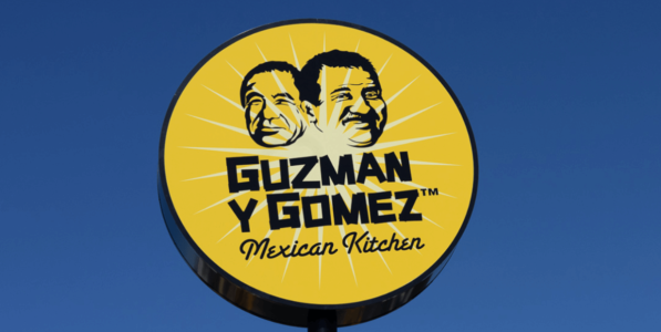
It seems like hidden meanings in logos are becoming a trend, and Woolies isn't the only one being investigated! Guzman y Gomez, the popular Mexican restaurant chain, is the latest to have their logo put under the microscope.
At first glance, the Guzman y Gomez logo appears to be a simple starburst design, but upon closer inspection, it's revealed to be a clever representation of a lime cut in half.
According to a representative, this element is no accident and symbolises their 'love of fresh ingredients'.
But wait, there's more! You might have assumed that the faces on the logo belonged to the restaurant chain's founders, but in fact, they're the fathers of two childhood friends of ex-New York hedge fund manager Steven Marks, the founder of Guzman y Gomez.
It's clear that these hidden details and meanings in logos are more common than we think.
Who knows what other fascinating stories are waiting to be uncovered in the logos of our favourite brands? Keep your eyes peeled because you never know what you might find!

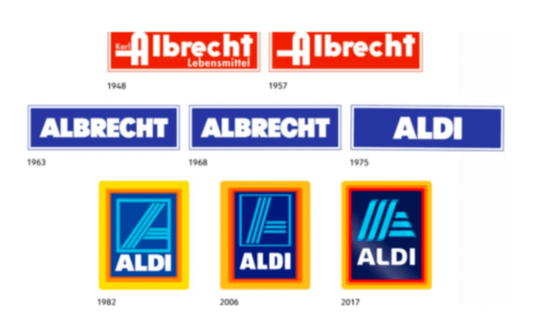
Let's not forget about ALDI and its iconic logo! In a previous article, we covered the history and meaning behind the supermarket giant's instantly recognisable logo, which has evolved over the years since its initial design in 1970.
Founded in Germany in 1945, ALDI has since expanded globally, becoming a household name and an integral part of the supermarket shopping experience in countries around the world. And with its distinct colour palette and memorable logo, it's no wonder why ALDI has made such a lasting impression on consumers.
For more on the fascinating history of ALDI and the inspiration behind its iconic logo, be sure to check out the story by clicking this link.
What are your thoughts, members? Have you ever taken a closer look at the logos of your favourite supermarkets? You might be surprised by the hidden details that have gone unnoticed!
From Woolworths' pumpkin-like design to Guzman y Gomez's lime starburst, there's more to these logos than meets the eye. Share your own discoveries in the comments, and let's uncover the secrets of these iconic brands together!
Are you curious to know what it is?
While the logo may appear to be a stylised 'W' at first glance, eagle-eyed shoppers have uncovered a fascinating detail that has left many stunned and intrigued.
It's a subtle, easy-to-miss element that will make you do a double-take – because if you look at it in a different way, it suddenly resembles a pumpkin!

Shoppers have been left stunned by a subtle detail in the Woolworths supermarket logo that often goes unnoticed. Credit: Shutterstock.
Yes, you read that right – a pumpkin. You may have never realised it before, but this intriguing feature of the Woolworths logo has been the topic of discussion among shoppers everywhere.
One online commenter even exclaimed, 'This is insane! I always thought it was an apple or a W, but I never realised it was a pumpkin!'
But is it really?
Well, we've got some insider news about Woolworths and its iconic logo that will blow your mind! Did you know that the employees at the grocery chain used to refer to the logo as 'Wapple'?
It's no wonder why, considering the striking resemblance between the logo and an apple. But that's not all – in 2009, tech giant Apple actually filed a legal case against Woolworths, claiming that the logo was too similar to their own.
Despite the legal proceedings, Woolworths stood firm in their assertion that the logo was either a stylised 'W' or a representation of fresh produce. And who can blame them? After all, the design is synonymous with quality, freshness, and a commitment to providing customers with the best products possible.
It's clear that the Woolworths logo has stirred up some controversy over the years, but one thing's for sure – it's an iconic symbol that has become synonymous with the beloved grocery chain.
So, the next time you're shopping at Woolies, take a moment to appreciate the 'Wapple' logo, the rich history behind it, and all its hidden meanings.
It seems like hidden meanings in logos are becoming a trend, and Woolies isn't the only one being investigated! Guzman y Gomez, the popular Mexican restaurant chain, is the latest to have their logo put under the microscope.
At first glance, the Guzman y Gomez logo appears to be a simple starburst design, but upon closer inspection, it's revealed to be a clever representation of a lime cut in half.
According to a representative, this element is no accident and symbolises their 'love of fresh ingredients'.
But wait, there's more! You might have assumed that the faces on the logo belonged to the restaurant chain's founders, but in fact, they're the fathers of two childhood friends of ex-New York hedge fund manager Steven Marks, the founder of Guzman y Gomez.
It's clear that these hidden details and meanings in logos are more common than we think.
Who knows what other fascinating stories are waiting to be uncovered in the logos of our favourite brands? Keep your eyes peeled because you never know what you might find!
Key Takeaways
- The Woolworths logo, which is widely known for being a stylised 'W,' has a hidden detail that makes it look like a pumpkin.
- The logo was even referred to as 'Wapple' by Woolies employees, and it caused controversy when Apple claimed that it was too similar to their own logo.
- Guzman y Gomez's logo also has hidden meanings, featuring a starburst design that's actually a representation of a lime cut in half and faces that are not the founders' but those of the fathers of two of Steven Marks' childhood friends.
Let's not forget about ALDI and its iconic logo! In a previous article, we covered the history and meaning behind the supermarket giant's instantly recognisable logo, which has evolved over the years since its initial design in 1970.
Founded in Germany in 1945, ALDI has since expanded globally, becoming a household name and an integral part of the supermarket shopping experience in countries around the world. And with its distinct colour palette and memorable logo, it's no wonder why ALDI has made such a lasting impression on consumers.
For more on the fascinating history of ALDI and the inspiration behind its iconic logo, be sure to check out the story by clicking this link.
What are your thoughts, members? Have you ever taken a closer look at the logos of your favourite supermarkets? You might be surprised by the hidden details that have gone unnoticed!
From Woolworths' pumpkin-like design to Guzman y Gomez's lime starburst, there's more to these logos than meets the eye. Share your own discoveries in the comments, and let's uncover the secrets of these iconic brands together!


