Shoppers spot 'hidden' detail in the new Officeworks logo

In today's ever-changing world, it appears that everyone is eager to update their image, especially well-established brands. One such example is Officeworks. Have you noticed any recent changes, members?

This retail giant, a staple in the shopping routines of many savvy customers, has embraced a complete redesign, shedding its nostalgic roots for a modern look.


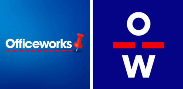
In a daring move, they have decided to replace their traditional blue, white, and red logo—once a familiar sight that spelled out 'Officeworks' in full.

Instead, their new logo features a minimalist approach, consisting of just two letters: 'O' and 'W', neatly stacked on top of each other.

This fresh design may be an ode to simplicity or a nod to the popular monogram-style logos favoured by younger generations. However, the exact inspiration behind it remains a mystery.

Screen Shot 2023-07-14 at 2.33.40 PM.png
The retail giant has started rolling out an updated version of its classic blue, white and red logo. Credit: Facebook/Officeworks.


This logo snuck its way onto Officeworks' latest paper shopping bags and already found itself printed upon the uniforms of the store's hardworking staff. You can even spot it on the company's social media pages—it's the new face of the brand, squarely in the corner of the screen.

While some shoppers admire the boldness of this visual change, the logo's intriguing artistic design has sparked significant attention and discussion online. Many people, puzzled and intrigued, are questioning whether the combination of the 'O' and 'W' holds a deeper meaning.

Some have wondered if the logo portrays the silhouette of a person or perhaps even a stick figure.


'One glance and I saw a figure. It looks like a person with arms. Can you not see it?' commented one shopper on a social media post.

Another agreed and added, 'It's a stick man with sturdy legs, no doubt!'

Such observations spark juicy discussions, with some even likening the logo to a 'jumping man' or a 'corkscrew'.

'Is it meant to be a person?' asked another, with a fourth saying: 'It's a person, right? Head on top with arms? You can't unsee it.'


Officeworks first introduced its new logo in 2021 through a Facebook post, triggering a range of mixed reactions from amused to disbelieving. The company received an overwhelming amount of feedback, forcing them to disable comments on the post.

It's safe to say that not everyone was pleased. 'Come again? Sorry, you might want to take that back to the drawing board,' said one customer, with another commenting, 'I'm not coming back to Australia if I have to see this.'

If this doesn't prove how influential logos and branding can be, then what does? It's a testament to their power! It's a tricky business, and Officeworks is definitely not the first to stir up intense discussions.

Do any of you recall the London 2012 Olympic Games logo? It was criticised for resembling an abstract art puzzle more than anything else. Ouch…

Key Takeaways

  • Officeworks has begun rolling out an updated logo that simply features the letters 'O' and 'W'.
  • Some people are questioning whether these letters, stacked on top of each other, form the likeness of a person or stick figure.
  • The logo drew a variety of reactions from users on social media, who thought it looked like anything from a corkscrew to a jumping man.
  • The company seems to have disabled comments after the logo's debut drew more than 500 mixed reactions.


Change is sometimes a good thing, and it sure keeps people talking. And while it's unlikely that your shopping experience at Officeworks will drastically change due to this logo revamp, we'll certainly be keeping our eyes peeled for a sturdy-legged stick man next time we pop into the store.

Members, what do you make of this subtle 'personification' in the Officeworks logo? Can you spot it, or is it all just imagination running wild? Share your thoughts in the comments below!
 
Sponsored
In today's ever-changing world, it appears that everyone is eager to update their image, especially well-established brands. One such example is Officeworks. Have you noticed any recent changes, members?

This retail giant, a staple in the shopping routines of many savvy customers, has embraced a complete redesign, shedding its nostalgic roots for a modern look.


In a daring move, they have decided to replace their traditional blue, white, and red logo—once a familiar sight that spelled out 'Officeworks' in full.

Instead, their new logo features a minimalist approach, consisting of just two letters: 'O' and 'W', neatly stacked on top of each other.

This fresh design may be an ode to simplicity or a nod to the popular monogram-style logos favoured by younger generations. However, the exact inspiration behind it remains a mystery.


View attachment 25148
The retail giant has started rolling out an updated version of its classic blue, white and red logo. Credit: Facebook/Officeworks.


This logo snuck its way onto Officeworks' latest paper shopping bags and already found itself printed upon the uniforms of the store's hardworking staff. You can even spot it on the company's social media pages—it's the new face of the brand, squarely in the corner of the screen.

While some shoppers admire the boldness of this visual change, the logo's intriguing artistic design has sparked significant attention and discussion online. Many people, puzzled and intrigued, are questioning whether the combination of the 'O' and 'W' holds a deeper meaning.

Some have wondered if the logo portrays the silhouette of a person or perhaps even a stick figure.


'One glance and I saw a figure. It looks like a person with arms. Can you not see it?' commented one shopper on a social media post.

Another agreed and added, 'It's a stick man with sturdy legs, no doubt!'

Such observations spark juicy discussions, with some even likening the logo to a 'jumping man' or a 'corkscrew'.

'Is it meant to be a person?' asked another, with a fourth saying: 'It's a person, right? Head on top with arms? You can't unsee it.'


Officeworks first introduced its new logo in 2021 through a Facebook post, triggering a range of mixed reactions from amused to disbelieving. The company received an overwhelming amount of feedback, forcing them to disable comments on the post.

It's safe to say that not everyone was pleased. 'Come again? Sorry, you might want to take that back to the drawing board,' said one customer, with another commenting, 'I'm not coming back to Australia if I have to see this.'

If this doesn't prove how influential logos and branding can be, then what does? It's a testament to their power! It's a tricky business, and Officeworks is definitely not the first to stir up intense discussions.

Do any of you recall the London 2012 Olympic Games logo? It was criticised for resembling an abstract art puzzle more than anything else. Ouch…

Key Takeaways

  • Officeworks has begun rolling out an updated logo that simply features the letters 'O' and 'W'.
  • Some people are questioning whether these letters, stacked on top of each other, form the likeness of a person or stick figure.
  • The logo drew a variety of reactions from users on social media, who thought it looked like anything from a corkscrew to a jumping man.
  • The company seems to have disabled comments after the logo's debut drew more than 500 mixed reactions.


Change is sometimes a good thing, and it sure keeps people talking. And while it's unlikely that your shopping experience at Officeworks will drastically change due to this logo revamp, we'll certainly be keeping our eyes peeled for a sturdy-legged stick man next time we pop into the store.

Members, what do you make of this subtle 'personification' in the Officeworks logo? Can you spot it, or is it all just imagination running wild? Share your thoughts in the comments below!
For god sake it is just a logo. Why try and make something out of it.
 
In today's ever-changing world, it appears that everyone is eager to update their image, especially well-established brands. One such example is Officeworks. Have you noticed any recent changes, members?

This retail giant, a staple in the shopping routines of many savvy customers, has embraced a complete redesign, shedding its nostalgic roots for a modern look.


In a daring move, they have decided to replace their traditional blue, white, and red logo—once a familiar sight that spelled out 'Officeworks' in full.

Instead, their new logo features a minimalist approach, consisting of just two letters: 'O' and 'W', neatly stacked on top of each other.

This fresh design may be an ode to simplicity or a nod to the popular monogram-style logos favoured by younger generations. However, the exact inspiration behind it remains a mystery.


View attachment 25148
The retail giant has started rolling out an updated version of its classic blue, white and red logo. Credit: Facebook/Officeworks.


This logo snuck its way onto Officeworks' latest paper shopping bags and already found itself printed upon the uniforms of the store's hardworking staff. You can even spot it on the company's social media pages—it's the new face of the brand, squarely in the corner of the screen.

While some shoppers admire the boldness of this visual change, the logo's intriguing artistic design has sparked significant attention and discussion online. Many people, puzzled and intrigued, are questioning whether the combination of the 'O' and 'W' holds a deeper meaning.

Some have wondered if the logo portrays the silhouette of a person or perhaps even a stick figure.


'One glance and I saw a figure. It looks like a person with arms. Can you not see it?' commented one shopper on a social media post.

Another agreed and added, 'It's a stick man with sturdy legs, no doubt!'

Such observations spark juicy discussions, with some even likening the logo to a 'jumping man' or a 'corkscrew'.

'Is it meant to be a person?' asked another, with a fourth saying: 'It's a person, right? Head on top with arms? You can't unsee it.'


Officeworks first introduced its new logo in 2021 through a Facebook post, triggering a range of mixed reactions from amused to disbelieving. The company received an overwhelming amount of feedback, forcing them to disable comments on the post.

It's safe to say that not everyone was pleased. 'Come again? Sorry, you might want to take that back to the drawing board,' said one customer, with another commenting, 'I'm not coming back to Australia if I have to see this.'

If this doesn't prove how influential logos and branding can be, then what does? It's a testament to their power! It's a tricky business, and Officeworks is definitely not the first to stir up intense discussions.

Do any of you recall the London 2012 Olympic Games logo? It was criticised for resembling an abstract art puzzle more than anything else. Ouch…

Key Takeaways

  • Officeworks has begun rolling out an updated logo that simply features the letters 'O' and 'W'.
  • Some people are questioning whether these letters, stacked on top of each other, form the likeness of a person or stick figure.
  • The logo drew a variety of reactions from users on social media, who thought it looked like anything from a corkscrew to a jumping man.
  • The company seems to have disabled comments after the logo's debut drew more than 500 mixed reactions.


Change is sometimes a good thing, and it sure keeps people talking. And while it's unlikely that your shopping experience at Officeworks will drastically change due to this logo revamp, we'll certainly be keeping our eyes peeled for a sturdy-legged stick man next time we pop into the store.

Members, what do you make of this subtle 'personification' in the Officeworks logo? Can you spot it, or is it all just imagination running wild? Share your thoughts in the comments below!
Does it really matter? Go to Office Works if you want and take no notice of how the logo looks !
 
In today's ever-changing world, it appears that everyone is eager to update their image, especially well-established brands. One such example is Officeworks. Have you noticed any recent changes, members?

This retail giant, a staple in the shopping routines of many savvy customers, has embraced a complete redesign, shedding its nostalgic roots for a modern look.


In a daring move, they have decided to replace their traditional blue, white, and red logo—once a familiar sight that spelled out 'Officeworks' in full.

Instead, their new logo features a minimalist approach, consisting of just two letters: 'O' and 'W', neatly stacked on top of each other.

This fresh design may be an ode to simplicity or a nod to the popular monogram-style logos favoured by younger generations. However, the exact inspiration behind it remains a mystery.


View attachment 25148
The retail giant has started rolling out an updated version of its classic blue, white and red logo. Credit: Facebook/Officeworks.


This logo snuck its way onto Officeworks' latest paper shopping bags and already found itself printed upon the uniforms of the store's hardworking staff. You can even spot it on the company's social media pages—it's the new face of the brand, squarely in the corner of the screen.

While some shoppers admire the boldness of this visual change, the logo's intriguing artistic design has sparked significant attention and discussion online. Many people, puzzled and intrigued, are questioning whether the combination of the 'O' and 'W' holds a deeper meaning.

Some have wondered if the logo portrays the silhouette of a person or perhaps even a stick figure.


'One glance and I saw a figure. It looks like a person with arms. Can you not see it?' commented one shopper on a social media post.

Another agreed and added, 'It's a stick man with sturdy legs, no doubt!'

Such observations spark juicy discussions, with some even likening the logo to a 'jumping man' or a 'corkscrew'.

'Is it meant to be a person?' asked another, with a fourth saying: 'It's a person, right? Head on top with arms? You can't unsee it.'


Officeworks first introduced its new logo in 2021 through a Facebook post, triggering a range of mixed reactions from amused to disbelieving. The company received an overwhelming amount of feedback, forcing them to disable comments on the post.

It's safe to say that not everyone was pleased. 'Come again? Sorry, you might want to take that back to the drawing board,' said one customer, with another commenting, 'I'm not coming back to Australia if I have to see this.'

If this doesn't prove how influential logos and branding can be, then what does? It's a testament to their power! It's a tricky business, and Officeworks is definitely not the first to stir up intense discussions.

Do any of you recall the London 2012 Olympic Games logo? It was criticised for resembling an abstract art puzzle more than anything else. Ouch…

Key Takeaways

  • Officeworks has begun rolling out an updated logo that simply features the letters 'O' and 'W'.
  • Some people are questioning whether these letters, stacked on top of each other, form the likeness of a person or stick figure.
  • The logo drew a variety of reactions from users on social media, who thought it looked like anything from a corkscrew to a jumping man.
  • The company seems to have disabled comments after the logo's debut drew more than 500 mixed reactions.


Change is sometimes a good thing, and it sure keeps people talking. And while it's unlikely that your shopping experience at Officeworks will drastically change due to this logo revamp, we'll certainly be keeping our eyes peeled for a sturdy-legged stick man next time we pop into the store.

Members, what do you make of this subtle 'personification' in the Officeworks logo? Can you spot it, or is it all just imagination running wild? Share your thoughts in the comments below!
Yep stick figure with a fat a$$.
 

Join the conversation

News, deals, games, and bargains for Aussies over 60. From everyday expenses like groceries and eating out, to electronics, fashion and travel, the club is all about helping you make your money go further.

Seniors Discount Club

The SDC searches for the best deals, discounts, and bargains for Aussies over 60. From everyday expenses like groceries and eating out, to electronics, fashion and travel, the club is all about helping you make your money go further.
  1. New members
  2. Jokes & fun
  3. Photography
  4. Nostalgia / Yesterday's Australia
  5. Food and Lifestyle
  6. Money Saving Hacks
  7. Offtopic / Everything else
  • We believe that retirement should be a time to relax and enjoy life, not worry about money. That's why we're here to help our members make the most of their retirement years. If you're over 60 and looking for ways to save money, connect with others, and have a laugh, we’d love to have you aboard.
  • Advertise with us

User Menu

Enjoyed Reading our Story?

  • Share this forum to your loved ones.
Change Weather Postcode×
Change Petrol Postcode×