Revealed: Hidden image in new Woolworths logo leaves everybody amazed!
By
- Replies 13
Woolworths shoppers have been left stunned after discovering a subtle detail hidden within the supermarket's recently unveiled new logo.
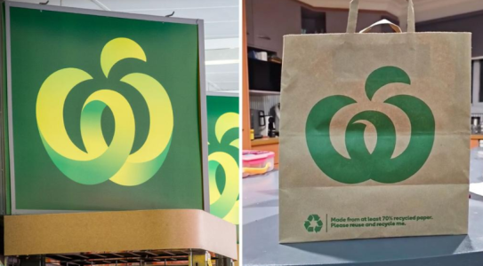
While most Australians are familiar with the iconic large green 'W' that adorns Woolworths stores and products, there is actually a lesser-known second version of the logo that appears on the company's paper shopping bags.
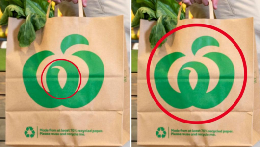
And it's this little-seen logo that has caused quite a stir among eagle-eyed shoppers who claim it contains a 'secret' hidden image.
The original Woolworths 'W' was designed over 40 years ago, combining the first letter of the company name with the vibrant green colours synonymous with fresh produce. It has graced Australian supermarket shelves ever since and is regarded as one of Australia’s most iconic and recognisable brand logos.
The second, streamlined version of the logo was created for single-colour reproducibility – vital for cost-effective printing on shopping bags and other paper merchandise. This minimalist linear logo swaps the solid green colours for a single outline.
And it’s within this pared-back version that some shoppers noticed something unexpected. Peering closely at a Woolworths paper bag, one shocked customer observed what appeared to be the figure of a bird nestled inside the logo’s curved lines and negative space.
'Once you see it, you can’t unsee it,' a shopper told 7NEWS.com.au, noting the pronounced skinny body and long curved beak reminiscent of a toucan.
Other eagle-eyed shoppers agreed there was definitely a bird-like figure visible within the logo’s clever use of negative space, but there was debate as to exactly what species of bird was depicted.
'Actually I think it looks like a peacock,' one customer speculated, 'the body and face is at the centre, and then the wings and feathers around to the side and up the back.' while another posted, 'That’s a turkey for sure, right?'
While Woolworths have confirmed that the hidden bird shape is entirely unintentional, it has nonetheless delighted and amazed many customers who were previously unaware of the subtle design quirk.
'My mind is blown!' exclaimed one stunned shopper. 'I think I’ve looked at the paper bags and the Woolies logo in store and on the website a million times, never noticed that they’re different.'
Intentional or not, hidden images and symbols within logos are a clever way for brands to engage more intimately with customers. Famous examples include the arrow in the FedEx logo, and the bear hiding within the Toblerone mountain.
Perhaps the designers sneakily concealed an animal in the depths of the Woolworths logo for customers to uncover and delight in discovering? Or maybe it’s just a happy accident, an unintended quirk of the negative space that has captured people’s imaginations.
Either way, it just goes to show that even the most iconic and familiar brand symbols can still contain surprises waiting to be uncovered by sharp-sighted fans.

For another funny insight, you may also want to check-out this another take on the Woolworths logo.
So next time you’re browsing the supermarket shelves or shopping in your favourite stores, you may want to have some fun and examine some logos of your beloved shops – you never know what hidden images may be waiting to be found! Let us know in the comments if you managed to spot some unusual stuff!
While most Australians are familiar with the iconic large green 'W' that adorns Woolworths stores and products, there is actually a lesser-known second version of the logo that appears on the company's paper shopping bags.
And it's this little-seen logo that has caused quite a stir among eagle-eyed shoppers who claim it contains a 'secret' hidden image.
The original Woolworths 'W' was designed over 40 years ago, combining the first letter of the company name with the vibrant green colours synonymous with fresh produce. It has graced Australian supermarket shelves ever since and is regarded as one of Australia’s most iconic and recognisable brand logos.
The second, streamlined version of the logo was created for single-colour reproducibility – vital for cost-effective printing on shopping bags and other paper merchandise. This minimalist linear logo swaps the solid green colours for a single outline.
And it’s within this pared-back version that some shoppers noticed something unexpected. Peering closely at a Woolworths paper bag, one shocked customer observed what appeared to be the figure of a bird nestled inside the logo’s curved lines and negative space.
'Once you see it, you can’t unsee it,' a shopper told 7NEWS.com.au, noting the pronounced skinny body and long curved beak reminiscent of a toucan.
Other eagle-eyed shoppers agreed there was definitely a bird-like figure visible within the logo’s clever use of negative space, but there was debate as to exactly what species of bird was depicted.
'Actually I think it looks like a peacock,' one customer speculated, 'the body and face is at the centre, and then the wings and feathers around to the side and up the back.' while another posted, 'That’s a turkey for sure, right?'
While Woolworths have confirmed that the hidden bird shape is entirely unintentional, it has nonetheless delighted and amazed many customers who were previously unaware of the subtle design quirk.
'My mind is blown!' exclaimed one stunned shopper. 'I think I’ve looked at the paper bags and the Woolies logo in store and on the website a million times, never noticed that they’re different.'
Intentional or not, hidden images and symbols within logos are a clever way for brands to engage more intimately with customers. Famous examples include the arrow in the FedEx logo, and the bear hiding within the Toblerone mountain.
Perhaps the designers sneakily concealed an animal in the depths of the Woolworths logo for customers to uncover and delight in discovering? Or maybe it’s just a happy accident, an unintended quirk of the negative space that has captured people’s imaginations.
Either way, it just goes to show that even the most iconic and familiar brand symbols can still contain surprises waiting to be uncovered by sharp-sighted fans.
Key Takeaways
- Eagle-eyed Woolworths shoppers have noticed a 'secret' image in a lesser-known version of the supermarket's logo, found on its new paper shopping bags.
- One shopper spotted what appeared to be the figure of a toucan in the centre of the 'W' logo.
- A Woolworths spokesperson confirmed the existence of two versions of the logo, explaining that an extra cut out is included for single-colour applications such as the logo on paper bags.
- The discovery sparked debate among customers, with some interpreting the image as different kinds of birds, while others were simply surprised to learn of the variation in Woolworths' logos.
For another funny insight, you may also want to check-out this another take on the Woolworths logo.
So next time you’re browsing the supermarket shelves or shopping in your favourite stores, you may want to have some fun and examine some logos of your beloved shops – you never know what hidden images may be waiting to be found! Let us know in the comments if you managed to spot some unusual stuff!


